Friday, 4 April 2014

Response to Tutor Feedback Assignment 5

I was pleased to receive my tutor feedback for this assignment because I had chosen a subject which interested me and was keen to use skills learnt during this course to pull it all together.

My tutor's main concern was that I had mixed black and white photographs with colour which may look incoherent as a set of images unless I set out a good reason for including both. I had stated that I used both colour and monochrome because I thought people may associate some bridges by colour – especially the two in Nottingham which are green. However, where I thought an image showed more form in monochrome, I converted it. Occasionally the weather conditions meant that the image looked more acceptable to me as the photographer in monochrome. Images I had seen whilst researching had been in colour and monochrome, and sometimes the same image was in both on different websites.

Image 1

"Striking." "Quite flat due to the lighting]...[try in black and white." "Symmetrically framed - however the arch is not quite centred in the frame."


black and white conversion
original


Following tutor feedback, I converted the original image to black and white and ensured that the outside of the arch was central. The monochrome image enhances the pigeon. I think the image works and the image looks timeless. I am not sure that the image is enhanced by the conversion, although I agree that when the image is enlarged, the bridge is more symmetrical.

Image 2
"A striking image of Trent Bridge. The tight framing of the arch fills the frame and the lamp post is nicely placed to lead the eye into that corner. Your framing has also handled the brick pier well as you have included enough of it to make it look like it should be there (it would have been easy to try to push this to the edge of the frame.). A well considered image - well done"

I was pleased with the comments for this image as I had thought hard about the composition to capture the essence of Trent Bridge without the football ground lighting and correctly expose of this bridge to show the underneath too. 

Image 3
"This image is interesting in showing the underneath. What has made this project interesting is that you have chosen unconventional viewpoints. This image feels quite cramped and i think it needs to be viewed really big! (It wasn't util I enlarged it that I spotted the bird flying)"

I agree with the above comments from my tutor regarding this image. I deliberated whether to include the bird or not. I eventually left it in to add interest. I will bear the advice in mind if I print it.


Image 4
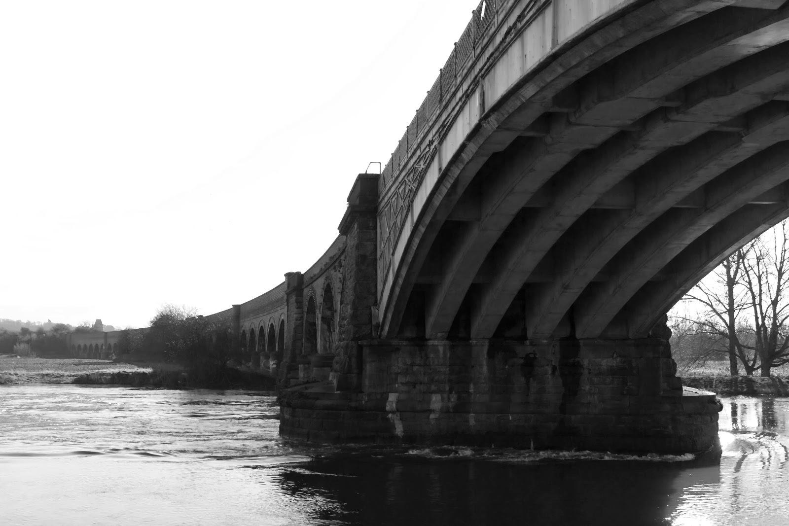
submitted black and white conversion
"This is a strong image and the decision to convert to black and white is good. However, do consider how a mix of colour and black and white fits into the wider project. The viaduct is shown well into the distance. I particularly like the starkness of the trees through the arch."


unedited colour version
In Photoshop, I converted the image to monochrome because there was not much colour in the image. I felt it added more continuity of colour and contrasted the bridge against the background. I removed the power lines because I had lost some detail through overexposing the sky and the bridge became the focal point.


Image 5
"A really interesting viewpoint where we are looking beyond the bridge. You have considered your options with limited access due to the water levels. The framing is very well controlled. The closeness to the stonework gives an unreal edge that makes it look like you have Photoshopped the background in. If you have sharpened the image, you you may want to lessen it to reduce the effect."

original
redo


I had a further attempt at this combination, this time using an eraser with a soft edge to rub out the unwanted image to reveal the image behind the frame. I think it has improved the look of the image. The background image is sharpened and the bridge colours are unaltered and not sharpened.

Image 6
cropped so tower is central
"This image is very different in style and mood. The brighter conditions give a stark powerful image. The smoke adds to the image and leads the eye over the walkway. Do consider straightening the image. If you are shooting straight on and using symmetry in composition then you want to make sure you are straight and it will make the image more powerful."
original


I revisited this image in Photoshop to see whether I could square up the image without altering perspective too much. Although I could crop one side so the tower was exactly central, I found that to start rotating the image or play with the lens distortion made the clouds, factory, verticals on the bridge and tower all at a slight angle and to then correct them meant rebuilding the image. I decided that  I did not have the skills to manipulate the sky so would have to leave it for this time and bear the advice in mind for future. As this is a suspension bridge, I am not sure that it is completely level. A tripod would have helped, but this was an opportunistic shot across a busy pedestrian walkway.

Image 7
"An image where you have played with the vertical and horizontal lines to a really good effect. The layering of the image works well and gives the viewer plenty to look at. This is another image that would work well bigger. Again, do consider straightening up the verticals so they are straight - there are grid lines in lightroom with the crop function that can help you do this."

My personal criticism in my accompanying write up to the image in my assignment was that the bridge does not appear straight, which may be a combination of using a telephoto lens positioned straight on to the image and optical illusion. I used a tripod with spirit level and remote on the camera to get the image as straight as possible, examined it carefully and tweaked in Photoshop. All the verticals are upright including factory, bridge supports and fence panels. I tried using lens distortion in Photoshop and rotating the image round to straighten the image but the verticals became crooked. This image nearly didn't make my final selection because of this problem but it is still one of my favourites because it is a view which I have not seen photographed and I like the colours and shapes within the image. 

Image 8
"In this image you have undertaken some good photoshop work. (Assignment 4 has really paid off) The train does make this image and give good context."

This image was one of my favourites because I had thought about the image I wanted and unable to achieve it, set about creating it. It showed me that Photoshop was a useful tool for enhancing an image and gave me more realistic feel of how to use it to my advantage than Assignment 4 because I had to learn the skills. With the tools now within my repertoire, I was able to use them to my advantage to help me create an image which wasn't quite there. For me, this image became a measure of my skills.

Image 9
"This image has a strong composition and the power lines add fine details against the imposing structure. The black and [white] conversion is quite heavy. The dark grey tone pulls the image down. I would consider not using it in the final set."

I decided to remove this image from the final set. A couple of people mentioned that they did not find it as interesting an image as I did. I agree with my tutor's comments, so will remove it.

Image 10
"In this image you have framed the bridge well by filling the top left corner. The strong lighting creates good shadows on the structure to give definition to the image."

I was pleased with this image. After discovering my initial plan was impossible due to high water levels and inaccessibility, I thought about how to make the bridge look powerful. I particularly like the effect of the bridge against the flooded landscape.

Image 11
"This is a more traditional view of a bridge compared to others in the project.  The night time has allowed you to show the lights to really good effect by using reflections in the water. A well chosen viewpoint and accomplished exposure."

I became concerned that I had intended to include a night time shot and it hadn't worked out. I was keen to practice a shot which included lighting because I hoped to bring together the skills practiced within the course. I did worry that this would become a tourist shot, so was pleased to see that my planning and research had paid off.

For assignment 4,in response to feedback, I had added photographs of my initial rough ideas to my blog. I had felt they were scruffy. My tutor encouraged me to continue with this practice.

Wednesday, 19 March 2014

A web gallery


Having reached this far along the course, I know what I would like from a web gallery. I had a web gallery under an email address which stopped when the service provider changed. This worked OK for my needs at the time and now it is time to look seriously at creating and maintaining one. 

I found a stand at The Photography Show (2014) advertising Web Sites which I had a look at. However, I felt they they were very professional, expensive  and for photographers running a business. At the moment, I need an arena to display my best images which I can add to. I have subsequently looked at various online companies and I think that Clikpic has the best layouts and templates for my needs at this point. I could start with a basic layout and cost price and and add to it as my collection and needs grow. Once I am established I would then look at a custom built site that I could edit as my portfolio and business grows.

I learned from a seminar I attended at The Photography Show (2014) given by Catherine Connor of Aspire Training that the site should be eye catching and say more than just my name. If I want the website to help attract people to it, I have to have the type of photographs that people are interested in on it as well as it being unique to me. I think it will take more planning and forethought than I originally envisaged and in the meantime, I shall record what I like about other photographers sites.


Ideas:
Gallery - portraits, landscapes - click on to expand
Slide show on carousel
Bio
Contact details
Expand later - Photography training - package details, previous clients, recommendations, 

Reference
https://alexiasinclair.com/


Sharpening for print

I started off by taking a portrait image which had been processed but not sharpened.

Using Photoshop and unsharp mask, I created 3 versions one close to the onscreen version, one fairly aggressive, and more aggressive. On screen, I thought I could tell a difference in the amount of noise visible in the background but this didn't transfer itself to the print. Using a magnifying glass and torch, there were a few areas such as the zip and pupils where I could tell that that sharpness had been applied.  I was not convinced that this had done the job I intended.


base
amount 90%
amount 150%
oversharp


I checked my camera, wondering perhaps if the settings in my camera were oversharp and maybe this was why my image had not sharpened visibly.

I took another image with more contrast and cropped to A4 using about a quarter of the photo. This time the exercise worked. 


base
amount 90%
amount 350% 
amount 250%
Summary of lily sharpening


Using a radius of 0.5 and a threshold of 1, I altered the amount of sharpening from the unsharpened image to 90%. There appeared very little difference on the monitor when viewed at 100%. In print and using a bright light and a magnifying glass, the difference is highlighted in red above. A few odd pixels had been brightened and in the middle there was a brighter edge along two of the stamens.

The effect of this surprised me. I hadn't really understood how unsharp mask worked and had been cautious in sharpening. The suggested starting threshold value is 90-120%. Gulbins and Steinmueller (2011) 

I kept the radius and threshold the same and altered the value to 250% to see the effect, illustrated by the blue line above. I could tell on the monitor that this was oversharp. A dark line was starting to become visible along the bottom stamen and the white petals had a darker patch on them (I wouldn't have called it a halo). 

I had still not seen the effects of noise, so kept the radius and threshold the same and increased the value to 350. On screen there was noise on the petals. This transferred to the print. The difference between 250 and 350 was alot more oversharpening and an increase in noise.

radius = "number of neighbouring pixels that are altered by the sharpening process" threshold = amount "of pixels to consider as an edge" 
amount = "how strongly edge contrast is increased" 
Gulbins and Steinmueller (2011) 

The exercise confirmed to me that at a threshold of 90%, radius 0.5 pixels and I would still have to be careful with areas which were too sharp, so continue to be cautious. There is an argument for only sharpening where it is needed. I felt it was a very beneficial exercise.

References
Gulbins and Steinmueller (2011) The digital Photography Workflow Handbook, Rockynook, C.A p112

Tuesday, 18 March 2014

Response to Tutor Feedback Assignment 4

Assignment 3 Reshoot

My tutor had suggested that I revisit Sutton Scarsdale Hall and retake some of the images. This I did, and resubmitted .She thought my images were much stronger. I learnt from this that it is worth reviewing my images and retaking if I am not entirely happy with them. She advised it would be useful to bear this in mind for assignment 5.

Assignment 4 Feedback


  •  "What is pleasing is that you have worked through (and documented) your work process.  Seeing the process of moving the shoot from outdoors to indoors allow for the challenges to be explained that you faced on this shoot.

  • You have also realized from the outset the considerations of the layout for the cover – and then explored various options on how to place the text.

  • The final composite image shows a realistic attempt at merging the images 

  • In addition this assignment has allowed you to explore Photoshop further.  It is very easy to look at an image and say ‘that has been Photoshopped’ however often the skill taken to undertaken realistic composite images is not realized.

  • You have made considerations of the ethics of image manipulation.  What is perhaps missing in your write up is an artistic appreciation of your image.  Although the artistic considerations are not made a key part of the course, an appreciation of the aesthetics of images is implicit throughout all the photography unit

  • Your log is continuing to develop well.  Exercises are well documented and explained.     The DPP course can lead you to be quite technical about your own work in the write-ups.  Don’t forget the artistic considerations as well – this is particularly important for assignment 5 as the final assignment.

  • The research on photographers section is starting to expand – do keep adding to this as you complete the final assignment.

  • For this assignment you have referred to research into existing publications throughout.  It could be worth making up a sheet of images to show some of this research visually.  One of the best methods of interacting with this type of research is then to annotate the images – just arrows with bullet points are perfectly fine.  This can be a very quick and effective method of pulling out the key technical and artistic considerations of research images and can help you to identify key themes (for examples cars placed on the diagonal).

I was pleased with this feedback. To me this was the one assignment when reading through the folder initially that I thought would be the hardest to do because I had to learn Photoshop skills and be able to use them creatively. I found that once I had added the skills to my repertoire, it became easier to look at an image and think about how I could enhance it. 

Having re-read my assignment, I now realise that an  artistic appreciation of my final image is missing.

So, what I like about my final image is that it looks realistic. I deliberately positioned the car so that there was some space around it, and the sandy track I placed the car on kept the car grounded. By positioning the car on a diagonal it adds drama and impact to the image. The car has somewhere to go by leaving track visible. By blending in a little shadow and using natural lighting, it gave the appearance of being taken as a single image. The green and red colours are harmonious and work with the autumnal leaves and slightly misty weather. The aerial on the car links the image to the title of radio control cars. In my opinion, the scale of the car is reasonable - it doesn't look out of place.

I had kept a record of research and development but hadn't included them because they were untidy. 


The initial hand drawn images were my ideas on how I would position a car for a magazine before I researched what was on the market.I find it easier to write notes because my drawing is very rough. 

To do
  • Photograph pages of hand drawn images from my jottings book (Done march 2014 see above)
  • Continue with Assignment 5 - personal project (Done)
  • Take note of comments re aesthetics and make sure I include in assignment 5 (Done March 2014)


Sunday, 16 March 2014

Assignment 5 Personal Project Reflection

Reflection on Personal Project for Assignment 5 Digital Photographic Practice 1


Bridges of the Navigable River Trent (Nottingham to the Humber Estuary)

Is the navigable River Trent recognisable from its bridges beyond Nottingham?

How well does your completed project match your original intentions?


My brief changed slightly as I explored the bridges because accessibility due to the river in flood made “postcard” images unachievable. As I learnt the heritage surrounding each bridge, I found they had unique characters and I needed to highlight individual aspects of the bridge. I discovered it is not necessarily the whole bridge but the detail that makes them recognisable.

Choice – was it a good theme?

Yes, and on rediscovering the bridges it became more about their form and beauty rather than whether I could tell which one is which, as each tells a story and no two are the same.

I explored my feelings towards manipulation as I knew how I wanted to represent the bridge and some did not live up to this. Images are displayed through Google maps, geocaching, geographical and historical sites. Watching Dan Snow journey along the Grand Canyon (Operation Grand Canyon, January 2014) to find old landmarks, I understood that recreating manipulated scenes posed questions. Although my image contains metadata with a date and place, one would have to consult other pictures taken at the time to find I had removed a pylon, streetlight or altered the perspective in the search of a balanced image.

This theme became topical. I noted BBC East Midlands News (12/2/14) reported George Stephenson’s Midland Mainline Railway bridges in Derbyshire were becoming Grade 2 listed because electrification of the line meant Network Rail must consider conservation before altering bridges.

What went well?

This project brought together elements looked at throughout DPP; from workflow, correct exposure, photograph enhancement, manipulation skills and developing my understanding of ethical issues. It was a good consolidation exercise.

What went badly?

  • Water levels on the River Trent rose meaning difficult access. Time of year and weather conditions will always be challenging.
  • Planned bridge works were not completed limiting certain photographs.
  • Football match on a planned photography day meant bridges were very busy.
  • Lack of industrial features around the rural bridges.

Did you stick to the original brief or did you depart from it?

I more or less stuck to the original brief but reading material changed due to availability.

Technical problems - how did you solve them?

I handheld the camera more than planned and increased ISO to achieve sharp images. With the train image to be in focus and where I wanted it, I took separate images and combined them in Photoshop. Gunthorpe Bridge (boats and railings) became a combined image giving the effect of the boats being closer.


Are you pleased with your final collection?

I enjoyed planning, research, pilot visits, shoots and reshoots and have a greater understanding and personal opinion regarding the manipulation of photographs to achieve my expectations. With a longer time frame, I would improve images such as the railway viaduct by waiting for overcast weather or develop the learning started at Newark (test shots).                          


I was interested to note that Debenhams’s coffee shop in Nottingham displayed two partial images of bridges similar to mine. I realised that mine were acceptable.


What could you have done differently?


I wouldn’t have done anything differently this time, but in future could use a different time of year or work over a longer period of time. 

Research proposal for Assignment 5 Personal Project for Assignment 5 DPP

Working Title
Bridges 

Subtitle
Bridges of the Navigable River Trent (Nottingham to the Humber Estuary)

Topic/Theme
Is the navigable River Trent recognisable from its bridges beyond Nottingham?

I was prompted to consider this question after glancing at a TV quiz show in which the presenter asked contestants to name rivers of capital cities by showing them an image of a landmark. Does one identify the river from the landmark (e.g. bridge) or is it the landmark which is identified with? In considering my local River Trent (one of the longest tidal rivers in England),which is steeped in ever changing history, I recalled that early Roman settlements along the Trent called for river crossings to be established, and due to natural and manmade changes in the river course, crossings had to be replaced. Decline in transportation of goods by train determined that some bridges fell out of use, and consequently the use changed. Bridges across the Trent were expensive to build and therefore to raise the revenue, tolls were charged. Recently, a toll bridge on the Trent was replaced and the toll increased. Local residents objected to the rise. Preservation by interested parties and listed building status keeps a bridge’s profile alive on the internet. Following an internet and library search, I concluded there is not much written or photographed on the River Trent despite its importance through history as an established trade route. So would people recognise the navigable River Trent by its landmarks once it has flowed through Nottingham?

Through research (internet) and visiting Nottingham Central Library (contains several books in the reference section on the navigable River Trent from a historical perspective) I will be able to source information and images to show the characteristics and importance of the bridges. Visiting the bridge and surrounding area will give me a firsthand perspective on how I could demonstrate the importance of the bridge. Reading books and or websites from architectural photographers will show me how to build on my existing knowledge and photograph the bridges creatively. 

I have selected 10 - 12 bridges from a possible 23 (24 including the Humber Bridge). By researching images on the internet I will know which are lit at night and will split the list into evening and daytime images. Bridges have different qualities – metal bridges could be photographed in sunlight or equally as effectively in mist. Some bridges may benefit from reflection so watching the weather forecast will enable me to plan journeys.

Audience
This is a personal study which will result in a collection of images. In time, it could be of interest to local history groups or museums alongside the accompanying research. It forms the basis of a project which could be further developed, such as social documentary on the impact of flooding, bridge repairs and change for example increased tolls.

Approach and methods
The bridges I have chosen are all different in age, design and usage. Some are lit at night, creating the possibility of using the existing lights for a night time image, some are metal so light reflects off this, and some are stone or brick with large arches. Some may benefit from monochrome. I hope to capture all or part of the bridge creatively. I will be reading around photographing architecture to help get the best out of this project.

Access
Reviewing the Ordnance Survey Maps used as part of the Trent walks, most bridges have access in the form of towpaths. The one bridge in question is Torksey Railway Bridge so I have chosen not to include this at the present time. Reading I undertook suggested that photographing bridges in America was a national security violation and considered a potential terrorism threat. I am not expecting to encounter any issues but will be prepared to leave if the situation is necessary.

Timetable and budget
I am expecting this project to last 4 months to correspond with my coursework. The bridges are accessible to me, and where I have to make a longer journey, I will be able to look at two bridges in a day (weather permitting). These structures should be accessible at all times of the day; it is only unforeseen circumstances such as accidents or extremely bad weather which will prevent access.

Proposed research references
(need to find architectural photographers books to read)
Taylor, Mike, Francis Frith's down the Trent (2001)
Physical Description: 119pLocal Studies Class: L90.3Subject Headings: River Trent – history Series: Francis Frith Collection Photographic memories ISBN: 9781859373118 Nottingham Central Library

Cement and Concrete Association ,Clifton Bridge, River Trent, Nottingham Publication Information: London Cement and Concrete Association {n.d.} Physical Description: Pbk Local Studies Class: L90.31 Nottingham Central Library

Tarbotton, M. O., History of the old Trent Bridge with a descriptive account of the New Bridge, Nottingham Publication Information: Nottingham Richard Allen and Son 1871Local Studies Class: L90.31Subject Headings: Trent River - description & travel Nottingham – architecture West Bridgford Library


Assignment 4 Real or fake?

Introduction
This assignment explores the issue of technique and ethical choices which are made in photography by designing and producing a photographic image illustrating an imaginary magazine. During the exercises and assignment work, I had the opportunity to clarify my thoughts and question my beliefs on whether alteration should take place and if so, what is acceptable and how tolerant are the viewers?

Context
During November, the Dukeries Rally passed though my local forest (Sherwood Pines) and I watched a couple of stages. Whilst there, I experimented with a few photographs. When considering a subject to study for this assignment, I recalled the event and dusted off my son’s radio controlled rally car. I planned to juxtapose it against the forest as a background to make it look like it was in the World Rally Car (WRC) series. We had other models of remote control cars which I could use to insert into the cover of my imaginary RC Car Monthly – a magazine for radio control car enthusiasts for a piece on restoration. I considered my plan a challenge to my manipulative Photoshop skills so decided to make the magazine cover something which would develop and enhance my skills.

Other themes I pondered were monster trucks, mountain biking, and food.  An internet search showed there were about four international radio control car magazines already on the market. By looking at magazines online and on sale in the newsagents, I had several ideas in my head.

Research on existing magazines
The entire collection of car, radio control, bike and food magazines I looked at had a front cover in portrait orientation. There were various designs for car and radio control covers; some used a bird’s eye view, some juxtaposition where a whole car or part of a car was set against a realistic background and a few had a plain background (shiny or dull). Magazines either had a large single picture, more than one car on the cover, or one car and an insert picture. Car(s) were positioned on the whole on the diagonal and one magazine had a couple of covers where the car was more of a triangle shape. Backgrounds either took up the whole of the page or were designed so that the writing was placed in the sky. Different types of cars had different characteristics of placement – for example most Porsche and race cars had four wheels on the ground, dirt buggies and monster trucks were on rocks and when one or more wheel was off the rock, a shadow was present. Most of the cars looked stationary with very little wheel motion and no spraying dirt.

Background Image
First of all I needed a background in which I could juxtapose my car. Considerations were orientation, scale, balance and colour. My original rally images were taken in landscape and I saw from this that I needed to take a background with portrait orientation.

I planned on paper how I thought the final image would look and decided to divide the frame into thirds. My idea was that the car, when positioned, would sit off centre on a diagonal and I would be able to alter the size of the car to fit.

I walked through Sherwood Forest looking for tracks and surroundings where an imaginary WRC rally may have taken place. Colours had to complement a red and white rally car, and trees in the background would add contrast to the final image. I wanted to leave space for positioning the title, subtitles and an insert picture.
I thought this was an acceptable background to place a rally car. No major changes were made at this stage – only checking colour temperature and a slight tweak in curves. I opened the image as a background in Photoshop CS3 and built up layers and vector masks on top of it.

The rally car image
Version 1
I thought (at the start of this assignment) that the car would have to be positioned in roughly the same angle that I wanted it to be in when cut out and pasted onto the background. In this image, the car was propped up on yoghurt pots. I cut and pasted this onto the background and realised that I could use the transform tool. I took the car outside to look at what the effect of natural lighting would be on the car.        

Version 2
The lighting outside reflected the trees onto the bodywork. Although my image contained trees, I felt that the reflection was unrealistic. I liked the yellow colour of the lights rather than silver to give a shining effect. After cutting and pasting this image into my background, I decided to change the direction of the car.


Version 3
With the car direction changed I decided to take the car indoors again as the paintwork showed too much reflection.


Version 4
Car now facing the correct direction, lit from a window rather than tungsten lighting. No reflection visible on bodywork. Black velvet used as a base because there was enough definition between wheels and material to enable polygonal lasso to work effectively.


Amalgamated image
Space left at the top for a title, space below right for insert, complementary colours (red / green), car positioned on track.


Exploration of areas of adjustment and manipulation to make a successful image
I cut around the car using the polygonal lasso tool and cut and pasted it into Photoshop CS3 as a new layer. Using the eraser, I removed the excess background. I cut and pasted the antennae across separately and attached to the car so that I could work at a different magnification. I cut and pasted the headlights across and fitted them using the transform tool to scale them in place. Using the transform tool again, I moved the car around, changed the scale and the perspective a little to make it look more natural on the page. I added a drop shadow gradient to this layer.

Tools used so far: cut and paste to combine two visual elements in one photograph, erase, transform scale, rotation and perspective, addition of drop shadow gradient.

Justification for using these tools was that they were necessary to make the car blend into the background and still look real. To have taken an image of an RC car in the forest would possibly involve a forced perspective to which one could still question the reality. By cutting and pasting an image and erasing the background to tidy it ensured the image fitted in to the background as I wanted it to.

I questioned the use of the eraser when my image would not quite fit in the white frame I created for the magazine title. I shaved off a little of the bumper and thought that it was acceptable because it was not a distinguishing feature. I could simply have resized the car without altering it.

Transform, rotate and change perspective were tools that I discovered which made manipulation so much easier. This cut down the work which I thought I was going to have to do by hand with re-positioning the car. So from this point of view, I thought it was acceptable because time taken to create an image must also be considered.

I applied a drop shadow layer style to the car which  I considered as acceptable because in reality the car had a shadow. Because I had used black velvet as a base, the shadow did not show up. The background was taken on an overcast day, but even then shadows are still visible.

Considered area of adjustment
I applied a gradient to the whole background image before starting to add titles to see if by toning down the brightness the image was more acceptable. I tried several types of gradients before removing it.

I debated whether to add a rectangle with a gradient behind where I was placing a title or subtitle. I did not think this looked effective either for my image, although some magazines appeared to use a technique similar to this.

At this point I was still considering the position of the title and whether to retake the background shot with more sky so that the title was not distracting. I recalled Kit Car magazine which I used to read had quite an expanse of white / pale page at the top. This was similar to a copy of a Canon EOS magazine I had.


Insert photograph
I used tungsten lighting to light the battered box and old model to illustrate a seasonal project for the winter. I adjusted the white balance in Photoshop and did a small amount of cloning and patching on the mini. I left some burnout and reflection visible as it was a “home project”. I cut around the shape and erased the rough edges after importing onto a rectangle shape layer on my Photoshop image. For the purposes of this document, I imported the cut out shape into a new blank page and changed the colour to one similar to that used on my original image.

Tools used: Cut and paste to combine two visual elements in one photograph, erase, transform scale, rotation and perspective, addition of drop shadow gradient, clone and patch. I felt there was too much burnout from the overexposed area on the roof and bonnet of the purple mini so replaced some of the pixels using clone and patch to enhance the image.  I changed the background to give more of a studio effect which I thought was acceptable as space was at a premium. I had taken an image with tools laid out too, but thought the image was too cluttered.

I opened the image in Photoshop Elements 5 and made some finishing touches such as a band across the bottom and changed the font styles. 

Finished cover

Ethical Justification
I like to produce realistic, acceptable photographs that inspire others and can be used for teaching or storytelling. I think surreal images are acceptable but they have to be believable. For instance, one of the collections that inspired me at Focus on Imaging Derby 2013 were  photographic images of plants by Putput which when viewed from a distance looked realistic but actually contained household objects such as spaghetti servers and body polishers. I was reminded of this work when researching photographs of Sian Bonnell. I felt that in keeping with the type of magazine I had chosen to illustrate I needed to keep my image real to attract the readership, although my final cover had combined images. I reconsidered my cover and whether I should have chosen a different type of genre, and the more I thought, the more ideas I came up with. I think that for where I was at the time with learning how powerful Photoshop is and what it can do, it was good to start with something quite realistic because I knew what I wanted to achieve and reached a point where I was satisfied. I think if I had created a surreal image, because it is not my type of image, I would still be left wondering if it was successful.

The ethical impact of the magazine on the environment is about encouraging recyclingI decided to include a photograph which could carry a restoration story in light of the fact that Christmas had just happened, children receive shiny new toys and old ones are sometimes put to the back of the cupboard. Perhaps their old, broken toys which need recycling or mending could become projects in the long winter evenings, so it seemed appropriate to include this on the cover. I used a natural environment to encourage people to go outside with their RC cars which could be seen as encouraging a healthy lifestyle.

The other consideration for my magazine cover was whether it would sell or just sit on the shelf.  I tried to pitch it in the middle of magazines; not elite and not a weekly edition. I imagined it being made of reasonable quality paper and being kept by the reader for some time as a reference magazine.

Conclusion
This assignment investigated the issue of adjusting and manipulating an image and still making ethical choices when producing a photographic image illustrating an imaginary magazine cover. During the exercises and assignment work, I was able to clarify my thoughts and question my beliefs on whether alteration should take place and how much was acceptable. I think my imaginary readers would find this magazine cover acceptable as it is not too far removed from the truth.

Key learning points from assignment
·   My initial point for using Photoshop for manipulation rather than enhancement at the beginning of the exercises and assignment work was virtually nonexistent. I took a logical approach to researching how to make things work and gradually built up skills which after some practice became second nature. I found some processes relied on trial and error to decide which methods worked for me. I was able to look at an image taken previously and decide which methods of manipulation would work.

  •  I began to understand how layers and vector masks worked which is an area I knew needed development.
  •  I felt a sense of achievement of being able to do more creative work in Photoshop.
  • I was able to explore how I felt about altering images and question the reality of images in magazines and adverts I looked at.

Areas for further development
  •  Use the available tools in Photoshop to become more creative. Now that I have completed this, it feels quite “safe”. However, at the beginning of the assignment, I found the task very challenging.
  •  Improve (faster, more efficient) work flow with Photoshop.

Bibliography
Clarke, G (1997) The Photograph, Oxford University Press, UK
Fox, A, Caruana, N, (2012) Behind the image, research in photography, AWA publishing, USA
Gulbins, J, Steinmueller, U (2011) The digital photography workflow handbook, Rocky Nook, USA
Wells, L (2009) Photography, a critical introduction, Routledge, UK
http://www.putput.dk accessed 16/1/14
http://www.sianbonnell.com/ accessed 16/1/14