I was pleased to receive my tutor feedback for this assignment because I had chosen a subject which interested me and was keen to use skills learnt during this course to pull it all together.
My tutor's main concern was that I had mixed black and white photographs with colour which may look incoherent as a set of images unless I set out a good reason for including both. I had stated that I used both colour and monochrome because I thought people may associate some bridges by colour – especially the two in Nottingham which are green. However, where I thought an image showed more form in monochrome, I converted it. Occasionally the weather conditions meant that the image looked more acceptable to me as the photographer in monochrome. Images I had seen whilst researching had been in colour and monochrome, and sometimes the same image was in both on different websites.
Image 1
"Striking." "Quite flat due to the lighting]...[try in black and white." "Symmetrically framed - however the arch is not quite centred in the frame."
 |
| black and white conversion |
 |
| original |
Following tutor feedback, I converted the original image to black and white and ensured that the outside of the arch was central. The monochrome image enhances the pigeon. I think the image works and the image looks timeless. I am not sure that the image is enhanced by the conversion, although I agree that when the image is enlarged, the bridge is more symmetrical.
Image 2
 "A striking image of Trent Bridge. The tight framing of the arch fills the frame and the lamp post is nicely placed to lead the eye into that corner. Your framing has also handled the brick pier well as you have included enough of it to make it look like it should be there (it would have been easy to try to push this to the edge of the frame.). A well considered image - well done"
I was pleased with the comments for this image as I had thought hard about the composition to capture the essence of Trent Bridge without the football ground lighting and correctly expose of this bridge to show the underneath too.
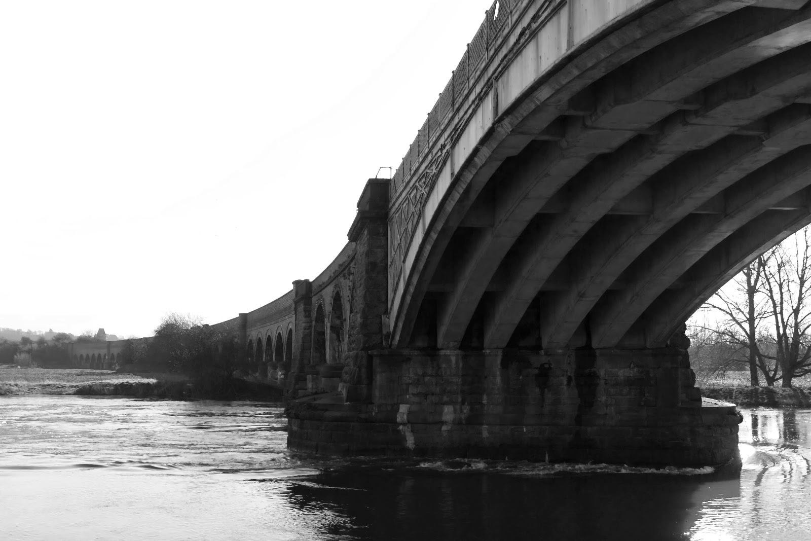
Image 3
 "This image is interesting in showing the underneath. What has made this project interesting is that you have chosen unconventional viewpoints. This image feels quite cramped and i think it needs to be viewed really big! (It wasn't util I enlarged it that I spotted the bird flying)"
I agree with the above comments from my tutor regarding this image. I deliberated whether to include the bird or not. I eventually left it in to add interest. I will bear the advice in mind if I print it.
Image 4
"This is a strong image and the decision to convert to black and white is good. However, do consider how a mix of colour and black and white fits into the wider project. The viaduct is shown well into the distance. I particularly like the starkness of the trees through the arch."
In Photoshop, I converted the image to monochrome because there was not much colour in the image. I felt it added more continuity of colour and contrasted the bridge against the background. I removed the power lines because I had lost some detail through overexposing the sky and the bridge became the focal point.
Image 5
"A really interesting viewpoint where we are looking beyond the bridge. You have considered your options with limited access due to the water levels. The framing is very well controlled. The closeness to the stonework gives an unreal edge that makes it look like you have Photoshopped the background in. If you have sharpened the image, you you may want to lessen it to reduce the effect."
I had a further attempt at this combination, this time using an eraser with a soft edge to rub out the unwanted image to reveal the image behind the frame. I think it has improved the look of the image. The background image is sharpened and the bridge colours are unaltered and not sharpened.
Image 2
I was pleased with the comments for this image as I had thought hard about the composition to capture the essence of Trent Bridge without the football ground lighting and correctly expose of this bridge to show the underneath too.
Image 3
I agree with the above comments from my tutor regarding this image. I deliberated whether to include the bird or not. I eventually left it in to add interest. I will bear the advice in mind if I print it.
Image 4
 |
| submitted black and white conversion |
 |
| unedited colour version |
Image 5
"A really interesting viewpoint where we are looking beyond the bridge. You have considered your options with limited access due to the water levels. The framing is very well controlled. The closeness to the stonework gives an unreal edge that makes it look like you have Photoshopped the background in. If you have sharpened the image, you you may want to lessen it to reduce the effect."
 |
| original |
 |
| redo |
I had a further attempt at this combination, this time using an eraser with a soft edge to rub out the unwanted image to reveal the image behind the frame. I think it has improved the look of the image. The background image is sharpened and the bridge colours are unaltered and not sharpened.
Image 6
 |
| cropped so tower is central |
"This image is very different in style and mood. The brighter conditions give a stark powerful image. The smoke adds to the image and leads the eye over the walkway. Do consider straightening the image. If you are shooting straight on and using symmetry in composition then you want to make sure you are straight and it will make the image more powerful."
 |
| original |
I revisited this image in Photoshop to see whether I could square up the image without altering perspective too much. Although I could crop one side so the tower was exactly central, I found that to start rotating the image or play with the lens distortion made the clouds, factory, verticals on the bridge and tower all at a slight angle and to then correct them meant rebuilding the image. I decided that I did not have the skills to manipulate the sky so would have to leave it for this time and bear the advice in mind for future. As this is a suspension bridge, I am not sure that it is completely level. A tripod would have helped, but this was an opportunistic shot across a busy pedestrian walkway.
Image 7

"An image where you have played with the vertical and horizontal lines to a really good effect. The layering of the image works well and gives the viewer plenty to look at. This is another image that would work well bigger. Again, do consider straightening up the verticals so they are straight - there are grid lines in lightroom with the crop function that can help you do this."
My personal criticism in my accompanying write up to the image in my assignment was that the bridge does not appear straight, which may be a combination of using a telephoto lens positioned straight on to the image and optical illusion. I used a tripod with spirit level and remote on the camera to get the image as straight as possible, examined it carefully and tweaked in Photoshop. All the verticals are upright including factory, bridge supports and fence panels. I tried using lens distortion in Photoshop and rotating the image round to straighten the image but the verticals became crooked. This image nearly didn't make my final selection because of this problem but it is still one of my favourites because it is a view which I have not seen photographed and I like the colours and shapes within the image.
Image 8

"In this image you have undertaken some good photoshop work. (Assignment 4 has really paid off) The train does make this image and give good context."
This image was one of my favourites because I had thought about the image I wanted and unable to achieve it, set about creating it. It showed me that Photoshop was a useful tool for enhancing an image and gave me more realistic feel of how to use it to my advantage than Assignment 4 because I had to learn the skills. With the tools now within my repertoire, I was able to use them to my advantage to help me create an image which wasn't quite there. For me, this image became a measure of my skills.
Image 9

"This image has a strong composition and the power lines add fine details against the imposing structure. The black and [white] conversion is quite heavy. The dark grey tone pulls the image down. I would consider not using it in the final set."
I decided to remove this image from the final set. A couple of people mentioned that they did not find it as interesting an image as I did. I agree with my tutor's comments, so will remove it.
Image 10

"In this image you have framed the bridge well by filling the top left corner. The strong lighting creates good shadows on the structure to give definition to the image."
I was pleased with this image. After discovering my initial plan was impossible due to high water levels and inaccessibility, I thought about how to make the bridge look powerful. I particularly like the effect of the bridge against the flooded landscape.
Image 11

"This is a more traditional view of a bridge compared to others in the project. The night time has allowed you to show the lights to really good effect by using reflections in the water. A well chosen viewpoint and accomplished exposure."
I became concerned that I had intended to include a night time shot and it hadn't worked out. I was keen to practice a shot which included lighting because I hoped to bring together the skills practiced within the course. I did worry that this would become a tourist shot, so was pleased to see that my planning and research had paid off.
For assignment 4,in response to feedback, I had added photographs of my initial rough ideas to my blog. I had felt they were scruffy. My tutor encouraged me to continue with this practice.