Monday, 23 December 2013

Addition

This exercise looks at “improving” a conventional landscape image in a variety of ways:
1. Taking two images (one exposed for the sky and one for the land) and combining the two using Photoshop to erase the overexposed sky, leaving behind the sky with the correct exposure.
2. Taking two images (one exposed for the sky and one for the land), combined the two using Photoshop then cut out the sky to reveal the well exposed sky and landscape.
3. Combining the same two images in a HDR software (included in Photoshop CS3)
4. Combining the two images using blending software in Photoshop CS3.
5. Taking the sky from another image and adding into the original landscape exposure image and blending the image together.
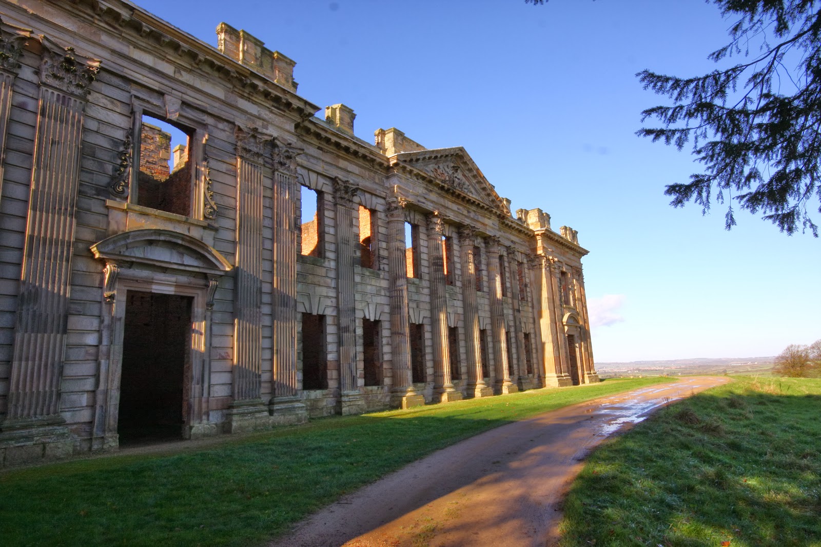
 Original
Optimized sky

Optimized landscape
 Image 1
Tippings wood addition 1 erased sky


To achieve this image, I cut and pasted the image with overexposed sky onto the correctly exposed sky. Using the erase tool, I rubbed out the overexposed sky, leaving behind one correctly exposed image.

Is this acceptable?
When viewed at 100%, the mist rising up from the trees is still visible, although there is a dark line where I have used a soft brush to soften the join between the two images. As a first attempt, I thought this looked acceptable. It took patience and for me the issue of how much time I would like to spend editing an image was raised.

Image 2
Tippings Wood addition 2 cut out sky


This was achieved by pasting the image with an overexposed sky on top of the correctly exposed sky and refining the edges.

Is this acceptable?
At 100%, the trees in the background, appear  as an overexposed distracting line. I Thought this way of combining the images did not work so well. It was quicker, but not as effective.

Image 3
HDR in Photoshop CS3 software

I combined two images using the HDR software in CS3.

Is this acceptable?
After setting up the images, the computer produced a version which was unacceptable to me. The sky has a large area of burnout. The field and gate were ok. I could in future try combining more images of different exposures rather than just two (although I did not take them on this occasion).

Image 4
Combined using blending software Photoshop CS3
Following Gulbins and Steinmueller (2011) P256 instruction on blending images, I used the following method to achieve the above image:
> Select, copy and paste the correctly exposed sky image onto the overexposed sky image
> Select > colour range to select the sky > set fuzziness > ok
> Select refine edge > set feathering of pixels > view in different versions
> Flatten image

Is this acceptable?
At 100% this looks ok. Once I understood the process, I thought this was quite easy to do and very similar to version 1 (using the eraser tool), but less time consuming.

Image 5
Sky

Sky added from another image
I started off trying to add a smaller piece of sky and found gaps in the photo with no pixels. I decided this was the time to start creating a bank of skies. Using my first complete image of sky, I was able to add the landscape as a layer behind the sky using an on line tutorial from Patterson (accessed 22/12/13).

This method involved making a mask and using sliders to blend in the sky. After having done this a few times to perfect my initial  attempt, I was fairly pleased with the result. I think it may be easier to use a graphics tablet rather than the pad on my laptop as there are a couple of areas such as around the tree when viewed at 100% where it is not quite perfect. I considered the colour of the sky, although this can be adjusted before adding using curves, and the amount of blending is to my taste.

Conclusion
I had not explored the world of altering images in this way, although I have several colleagues who enjoy manipulation similar to this and who have shared their experiences with me. I had previously thought that Photoshop’s software held the key to HDR photography, and this exercise challenged that belief. I was disappointed with my result. I think the best results I had were with the blending two images (image 4) and changing the sky (image 5). As for whether it is legitimate to alter a photograph in this way; I think it is acceptable to enhance an image providing considerations are taken into account such as direction of the sun, shadows, reflections, are taken into account, especially if the sky is dull and lacks interest. The experience of viewing the photograph has to be believable.

Bibliography
Gulbins. J, Steinmueller. U, (2011) The Digital Photography Workflow Handbook, Rocky Nook, CA

Tuesday, 10 December 2013

Improvement or interpretation?

Whilst researching and experimenting with taking photos of mountain bikers, I discovered that to give the photograph real impact, flash was necessary when working in the forest.

This image was taken at 7:45pm on a summers evening when my husband was just about to cross the finish line at a local race night. I had not anticipated that a low sun and all the trees would affect the exposure  quite so much. He was also wearing dark clothes so blended in with his surroundings well.

In order to give the image maximum impact and make the rider visible stand out from the background, I had to edit the photo in Photoshop.

Using the magic lasso tool in Photoshop, I learnt to follow the outline of the figure using the pad on my computer. I think it would be easier to control and set the points with a graphics tablet and pen. Despite my best attempts at redoing the shape with the tool several times, using the feathering tool and refining the edge, I was not happy with the outcome. I tried using the magic wand but this selected too much background and did not seem to differentiate between the colours of the rider and the trees. Once I had selected the area to be worked on, I decided that the colour temperature needed adjusting. I opened levels and tried an area of grey to sample but could not get it quite right. I selected the white dropper which seemed to correct the colours. I checked the black and white points which were OK.
Original
Edited


I did find this a bit fiddly to do and thought that the results did not look that professional. However, it corrected the colours of a small area and made the rider stand out.  The pixels of the grass and legs were not found automatically by the tool, and it had difficulty distinguishing between the black clothes and black bike. Even the helmet caused confusion.

Do I think it is acceptable to alter the image like this? Yes because it enhances what I saw originally. However, I think it would still be better to get the exposure right in the camera or use flash in this situation to lift the rider out from the background. When looking at this type of photography, I discovered that it would be better if my husband was wearing a more colourful top. Red or orange would have made him stand out against the background, so I think an important element is planning and communication. I would not go so far as to deliberately change the colour of his kit in post processing because I like to record the event as it was. 

Reading an article in Mountain Biling UK (Summer 2012) Darkins et al suggested that "Jamie, maybe upset at how I've dressed him, proves his dowhill abilities and is gone". It confirmed to me that the writer (and perhaps the photographer) had thought about how to make the subject stand out against the natural background of the Gower Peninsula. Unfortunately, I couldn't work out from the photographs which rider Jamie was; the establishing shot contained three riders (one blue, one black and one red top). The red shirted rider only appeared in two of the eight photographs, so maybe he was dressed in red!


Reference
Darkins, M (2012) The Gower Peninsula,Mountain Biking UK Summer 2012 Issue 280 Future PLC UK p199


Bibliography

Steinmueller, U, Gulbins J, (2011) The Digital Photography Workflow Handbook, Rocky Nook, CA p124

Monday, 9 December 2013

Corrections

Dust spots
The first part of this exercise looked at removing dust from an image. I had been used to using the clone stamp tool to remove dust as one of my lenses has dust on it that appears in the same place every time. I read up on how to use a tool in light room to remove dust and was surprised at how simple it sounded.
Taking one of the original  images taken for my last assignment which I knew had dust in the sky, I viewed it in Lightroom. There were 4 visible dust spots.

Using the following method, I removed the dust spots:
Develop > spot removal tool > check size (alter size with slider) > check opacity (100%)> left click > close

(No further alterations made)

Original JPEG
This worked effectively and remarkably quickly and easily.
I had used the clone method in Photoshop to remove dust spots. I will adopt the above method when appropriate.
Dust spots removed in Lightroom


I consider it acceptable to remove dust spots like this from an image because when I viewed the original image, there was no dust present to the naked eye. I was quite happy to remove it.


N.B. The difference in these two images is not intentional. The JPEG was uploaded straight to Google Picassa from my computer with no processing. The RAW and JPEG image were looked at together as one image in Lightroom, exported back to my pictures and uploaded to Google Picassa. The only alteration made was the dust spot removal. I think the difference in brightness and contrast is that between the unprocessed RAW and the JPEG images.

Lens flare
Unable to find an image on the OCA  student website, I searched through some images of mine for lens flare. This was taken last year when I was learning about edge lighting and I kept it for reference of how not to achieve edge lighting.

This image would normally have been deleted because I think the lens flare detracts from the image. There are occasions where it can be used to add impact and creativity. My son had a BMX poster on his bedroom wall with the rider in mid air with a lens flare which added some drama to the image.

18/1/14 Revisiting Chase Jarvis's website, I noticed that he had a few images where he used lens flare to enhance his images. It made me question whether it enhanced or took away anything from the image. Personally it is not a style I would adopt for this image because I would prefer to see the runners, but it shows the weather conditions of the moment. Scrolling forward to the runner on the beach, I appreciate the lens flare and position of the sun because it adds a drama to the runner.

I opened the image in Photoshop as a JPEG > duplicate layer > clone stamp > selected darker, similar area and removed polygons > flatten image

I also considered what this image would look like if I used the image without the polygons and applied an S curve to bring out the detail. The wall looks more three dimensional but the lens flare is still distracting. So this image should be binned.

(No further alterations applied)

Original     


lens polygons removed 


S Curve applied

Friday, 29 November 2013

Assignment 2: Seeing like your camera

Assignment 2: Seeing like your camera September 2013

Introduction

This assignment looks at correct exposure for high contrast subjects. It requires an understanding of how the camera sees, so that the image which the camera took was as I saw it rather than what the camera saw. I chose to work in mainly JPEG images because no post processing was allowed.

I chose four high contrast situations to look at in detail:
· Street scene in the middle of a clear sunny day - narrow streets and high buildings which cast deep, long shadows
· Photographing people in the shade while the background is in the sunshine
· Any backlit scene, whether in direct or indirect light
· Indoor scenes illuminated by a single source of artificial light of high luminance

This assignment is divided into two parts. . My research is outlined for each type of scene at the beginning of part 1. I have submitted three JPEG images for each situation and discussed the technical challenges which each situation presented, explained how I dealt with each high contrast scene and listed the decisions I took regarding the camera settings and composition. I analysed the difference between how I saw the scene and how the camera sensor rendered it.

In part two; I have revisited the category backlit scene, whether in direct or indirect light and analysed what would improve the image in order to reduce the contrast. I have re-photographed the same three images in different conditions.

Part 1 - Research

Street scene in the middle of a clear sunny day – narrow streets and high buildings which cast deep, long shadows

Freeman (2008) p27 shows an image of a building as part of his case study of high contrast. Looking at the image, I noticed that shadow covered the front of the building, and the bright sunlight, dark shadows and different reflectivity of components such as windows, white and different coloured paint ensured exposure had to be carefully controlled. Freeman described the type of metering he used for the situation and the effect of reducing or increasing the exposure. I found this linked Fyre’s (2009) explanation about applying the zone system to landscape photography. 

My visit to the North East Midlands Photographic Society’s Exhibition in Mansfield earlier this year revealed two photos; one of Chain Lane in Newark ( Jane Donovan) and one called “Return to the shadows” (Stuart Crump) (taken outside the UK), both of which inspired me to look at Chain Lane in Newark. Crump used back lighting which gave the subject a two dimensional feel and Donovan’s photograph was a night time scene.

I checked the weather forecast daily for five days previous to my trip to Newark on Trent. All was in my favour for a bright cloudless day when I left home. By the time I arrived in Newark half an hour later, the sky was a mixture of sunshine and cloud. I decided to continue with my quest of street scene photographs because when the sun came out the light was very bright.

As I visit Newark regularly, I had local knowledge of which streets were narrow and the number of storeys of some of the buildings. My planned day was not a busy market day so I was able to stand and wait for the sun to appear without taking up too much room on the narrow streets. I checked the direction in which the streets faced on Google maps. 

I had taken a similar photograph of Charles 1st Coffee House when studying blue and orange as part of the colours exercises for The Art of Photography 1, although I found the clarity distorted by using a higher ISO than I needed to and the image was grey instead of white. I decided to improve upon this. 

To summarise, I decided that the key to this was to use partial metering and meter the brightest and darkest parts of the image using AV mode, work out the middle point and use this as a base setting, then manual mode to stabilise the settings and bracket (Freeman (2008)’s recommendation). Fyre (2009) suggested finding the brightest point of the image and overexposing by up to two stops. I would need a small to middle sized aperture to keep the subject in focus and an ISO which was as low as possible to avoid a grainy looking image. I chose daylight white balance at 5200Kelvin as it was a bright day

Photographing people in the shade while the background is in the sunshine

In the past, I had always used evaluative metering for portraits. I started this research with a photo shoot which was an exercise of trial and error using the same method as described previously. When reviewing my images later, I was able to see what was successful and what wasn’t, and how in camera flash had lifted some of them but wasn’t the answer to everything. 

I came across several articles on the internet which suggested that when taking a portrait in the shade with a brighter background, partial metering worked well. This too, used a similar technique to the zone system.

Laurencekim (2011) suggested that it was possible to work out how much to overexpose skin tone by observation and practice. For example, someone with a dark skin tone is close to 18% grey and so the exposure would not have to be overexposed as many stops as someone with a pale skin. His pictorial exercise made it easy to understand. He also suggested that exposure could be checked using your hand at arm’s length, which I found a valuable tool as my models didn’t have to pose for as long.

With portraiture in this high contrast environment, the research led me to believe that without using on camera flash or equipment, the best way of managing the exposure was to leave the background over exposed because it is fashionable at the moment, and in line with some studio portraits. If the person is correctly exposed, the viewer will look at the person first rather than the background.
 
To summarise, I opted to use partial metering and increase ISO if necessary to enable a fast enough shutter speed to freeze the subject and avoid motion blur. The aperture should be large to let the light reach the camera sensor and a small depth of field is required so that the background is out of focus and the subject is clearly distinguishable from the background. I used daylight white balance to keep the lighting as natural as possible without trying to warm up the scene because I wanted the skin tone to look natural with correct exposure.

Any backlit scene, whether in direct or indirect light

I revisited images I had taken in The Art of Photography (November 2012) as part of the lighting exercises and re-read this area of my assignment. I read two books; Fyre (2009) and Edwards (2009.) Both used backlighting for some images; Edwards more than Fyre. Edwards concentrated on singular wildlife images such as flowers and fungi, birds and animals. I liked the simplicity of his birds in flight with rim lighting and whilst I have neither the skills nor equipment to take images like his, I thought about applying it to a singular flower. His poppies (p50) were made translucent by backlight and still retained interest with shadow detail. From my own research, I discovered that even a thick leaf such as Ivy, when back lit, became translucent. 

Fyre included a backlit image of two white flowers (p64) which had a pleasing simplicity to it. I found his book included more technical instruction such as an introduction to the zone system which I practiced as I had not come across it before.

I concluded that these scenes benefit from partial metering, using AV to measure the brightest part, stabilising the exposure values in manual and reducing by one and a half stops, and bracketing to ensure an even exposure was achieved. I would use a low ISO to minimise noise and a medium aperture to illustrate detail. To handhold the camera I had to balance the aperture and shutter speed to keep the ISO low. I used daylight white balance to keep the photos as natural looking as possible. Shade and cloudy would introduce warmth (orange cast).

Indoor scenes illuminated by a single source of artificial light of high luminance

Research I undertook indicated that the numerical value (shutter speed) of the light source (e.g. a light source or the sun) should be discounted because it gave a high value which would overexpose the image. I used partial metering to control the scene. Here the ISO could be low if the camera was tripod mounted, as I learnt from a previous exercise that noise was greater in shadows and this was quite a dark scene. 

Colour temperature was important too, because I needed to tell the camera to use the right temperature. I knew from the colour temperature exercises how my camera would handle candlelight, and previous exercises how it saw tungsten light. I decided to use tungsten (3200Kelvin) to give a warm glow to the images.

Part 1 Images

Street Scene Image 1 Chain Lane, Newark on Trent

F13 1/125 ISO 100 18mm, daylight white balance, partial metering, 11:52am
Technical challenges
This scene presented challenges such as being in part shadow and part sunshine which gave areas of extreme contrast. The sun was almost overhead and the best direction to take the photo meant that the scene lighting was slightly off axis backlighting. The windows added reflections to the shadows and the clouds were very bright and could easily be burnt out. I wanted to keep the signs in focus, the character of the lane visible and detail in the shadows.
 Dealing with the high contrast
In order to manage the contrast, I measured the brightest and darkest areas of the image in AV with partial metering and took an average of the two readings. I set the camera to manual and found the middle setting. After reviewing the histogram I made exposures either side of the setting and checked that the highlights had as little clipping as possible. I zoomed into the shadows area of the image on the back of the camera to check it had retained detail.

Camera settings and composition
The direction of Chain Lane runs from west to east and I thought this was the most photogenic direction. I stood off centre to capture the character of the crooked buildings. The person is backlit and I wondered if his shadow would look better behind him. I think the shadow adds some interest to the image. I kept the ISO to 100 to keep the noise levels in the shadows as low as possible. On reflection I possibly should have used a tripod or increased the ISO for a sharper image. 

Street Scene, Image 2, Charles 1st Coffee House, Kirk Gate, Newark on Trent

F13 1/125 ISO100 18mm Daylight white balance, partial metering, 12:10pm
Technical challenges 
Technical challenges consisted of not overexposing the detail on the white plaster or clouds at one end of the scale or underexposing the black areas of the building. A shadow on the front made distinct areas of white, grey and black which all needed to be the right colour. Definition should be retained between the paint, plaster and wood. The building contains different reflective surfaces such as the wood, paint, plaster, windows, pavement which gave different areas of brightness.

Dealing with the high contrast
I used partial metering and measured different areas so that I had readings for the highest and lowest shutter speeds within the scene. I took an average of the two and checked the histogram. I took one photo either side (bracketed) and checked the histogram again for highlight clipping on the right and the shadow detail on the left hand side of the histogram.

Camera settings and composition
The crooked line of buildings added interest to the photo. Should I include people? They add interest and depth to the scene, especially the couple crossing the road because they are more visible than the couple who blend in with the building. I kept the shutter speed fast enough so that the people were not too motion blurred. I moved my position to crop out a car on the same side of the road but was unable to move the car on the other side or the road without losing the building. A small to medium (F13) aperture kept the writing (coffee shop name and blackboards) in focus. To retain clarity in the shadow areas meant using a low ISO of 100 to reduce noise. Sky measured 1/350, shadow measured 1/20. The best exposure was 1/125.

Street Scene, Image 3, Carter Gate, Newark on Trent

F13 1/125 ISO100 18mm, Daylight wb, partial metering, 12:37pm
Technical challenges
One side of the street is in sunshine, the other in shade. The clouds were very bright and light levels fluctuated as the sun went behind the cloud. The windows on the building reflected light when in the sun.
 
Dealing with the high contrast

I took 3 images after working out roughly what speed I needed to set the camera on based on the in camera meter readings. The brightest parts of the scene measured 1/350. I took this at 1/125 which is 2 whole stops above 18% grey. 1/90 was overexposed (clouds burnt out and sunny side too bright). 1/180 was underexposed and the shadow contrast was too dark. The middle exposure was correct, which backed up what Freeman (2009) and Fyre (2009) had described. 
Camera settings and composition
The end of the street has a focal point (tower) and there are features such as a car and a person to add interest to the street. The sky adds interest. In hindsight, the bottom of the street has more interest so I would reframe the image. By using a low ISO, I have retained detail in the shadow and the image is not noisy. I used an aperture of F13 to give a good depth of field and a fast shutter speed to ensure the detail stayed sharp whilst handheld. Daylight white balance ensured the colour temperature remained accurate. 

Difference between how I saw all three scenes and how the camera sensor rendered them
As all three photos were taken using a telephoto lens at the same length (18mm), the same ISO (100), and the same using the same focal length (F13), I looked at how the camera would see the images based on these specifications. With a telephoto lens, the camera uses a narrow angle of view and makes objects appear the same size rather than distorting them and making them different sizes which a wide angle lens would do (although 18mm is fairly wide). Eyes work more like a telephoto lens in this respect. I set the F stop to F13 and the camera let enough light into the camera before I pressed the shutter for a reasonable amount of the image to be constantly in focus. The low ISO meant that the camera recorded minimal noise, but details in the shadows were not picked up as well as they would be with my eyes because my ISO can change depending on what I am looking at. Similarly, when I view a scene, I don’t take it all in in one go; although my eyes see at F22, there are variables which reduce this such as the amount of daylight, the curved shape of my retina and the health of my eyes. My vision is a fish eye shape from both eyes which translates to a field of vision of 120-140 degrees together and when looking through the view finder with one eye this becomes reduced. It is only the central part of the seen (by the eyes) image that is in focus and colour. Towards the edges of the image, the eyes see in monochrome and the image becomes blurred. 

Reading I undertook suggested that we see what interests us. For example, in the image of Chain Lane (Image 1), I saw a man in the sunshine and my eyes gravitated towards him. I ensured that he was in my picture. My camera would capture the picture when the shutter was pressed, but it is control over what the photographer sees that makes a good/interesting image rather than a dull one. Eyes have the advantage of being able to skip backwards and forwards over a scene, but the camera records it, suggesting perhaps why sometimes on reviewing an image something is seen which the photographer did not recall seeing at the time of shooting.

Charles 1st coffee shop (Image 2) would be seen by my camera in different shades of grey (white, grey, black). It is me who has set the parameters for measuring the shades and ensure the correct colours are achieved and detail retained. 

In (Carter Gate) Image 3, my eyes surveyed the whole scene by moving my head and resting on scenes within the scene. My eyes looked at textures and shapes working everything out to recreate the scene, and I think this is where my eyes saw something different to the camera. If I had stood further up the street; I would capture more interest rather than an empty, uninteresting foreground. I have left this image in rather than reshoot to illustrate my learning.  Photographing people in the shade while the background is in the sunshine Image 1
1/180 F4.5 ISO 100 32mm Daylight white balance, partial metering
Technical challenges
This ancient oak tree was very leafy, casting a dark shadow underneath it. The background was bright and the sun was behind the model, which has caused the trees to be almost in silhouette. I needed to overexpose the model to make her show up.

Dealing with the high contrast
By using partial metering and requiring the subject to be correctly exposed
rather than the whole scene, I found it easier to take this type of image once I had worked out a method which suited me. I measured the camera speed required and overexposed the model by two full stops which made her show up against the overexposed background.
Camera settings and composition
I did not notice at the time of shooting, but on examination the left shoulder is rim lit which separates the subject from the trunk of the tree. The red tee shirt and green tree work harmoniously. I positioned my daughter straight on to the camera because this is the view she prefers. F4.5 gave a wide aperture to allow light in and a shallow depth of field. ISO 100 ensured there was little noise in the shadow areas. Daylight white balance gave a natural colour cast to the scene. Partial metering enabled me to take meter readings and work out the shutter speed needed. This was a trial and error shot which I was pleased with. In future I would change my method to the one I used for the next two images.

Image 2
1/180 F5.6 ISO 100 35mm Daylight wb, partial metering
Technical challenges The sky was still quite bright, the model’s clothing was dark and a bright yellow sign is visible in the background. The railing reflects light off it as it is a shiny surface.

Dealing with the high contrast
I took meter readings from areas of the model’s face which were brightest such as cheeks, forehead and nose, and decided that as she is so pale, I would need to use exposure compensation of one and a half to two stops. I bracketed to make sure I obtained an acceptable shot. The top of sky is burnt out and there is a patchy thin line around some of the model’s white top suggesting burnout. 


 Camera settings and composition


Standing in a covered grandstand (which is not part of the scene); I wanted to include some of the view to establish a place. I decided to position my daughter so she could
watch the action below on the racetrack. F5.6 gave a wide aperture to allow light in and a shallow depth of field. ISO 100 ensured there was little noise in the dark areas. Daylight white balance gave a natural colour cast to the scene. Partial metering enabled me to take meter readings and work out the shutter speed needed. The sky perhaps needs to retain a little more detail at the top, and maybe I should have included some of the grandstand instead of having sky which has lost colour detail. 
Image 3
1/180 F4.5 ISO100 50mm daylight white balance, partial metering
Technical challenges
The models clothes were black and white so these needed to be black and white instead of grey. The background was bright and people kept appearing at the back of the scene.
 

Dealing with the high contrast 
Having learnt to expose correctly for my daughter’s skin tone, I included my son who is half a stop darker. Lawerencekim (2011) explained that for people with different skin tones, one has to “Pick one person to base the exposure on. If you do it correctly, every person in the picture will have proper exposure”. I tried this, taking readings using my daughter’s skin tone and the exposure looked correct. The background is overexposed but the subject is not.

Decisions I took regarding the camera settings and composition

An aperture of F4.5 and speed of 1/180 kept the speed fast enough to allow me to use ISO100 so the image is sharp. I used daylight white balance to keep the colours as accurate as possible. I positioned the children in the shade of small trees with shade patterns on the grass.

Difference between how I saw all three scenes and how the camera sensor rendered them
The similarity between all three images is that they have a large aperture (F4.5-5.6) and an ISO of 100. My eyes are capable of that (they can stop down to F2) and my ISO can be as low as ISO1. The camera would look at the scene and try and expose an average of the scene, so it would not overexpose the background but the people would be underexposed. What my eyes did was look at the interesting part of the image (faces) and register them because they were in the centre, and combine that with brightness of the skin tone and textures to build up an image. I couldn’t really see the peripheral area of the image when looking just once without moving my head and my eyes would see the peripheral part as monochrome. So by taking control of my camera and overexposing the background to balance out the skin tone, I have allowed my camera to take the image so that it makes it easy for my eyes to register it. 

Any backlit scene, whether in direct or indirect light


Image 1, Southwell Minster, Nottinghamshire
F11 1/350 ISO100 18mm Daylight wb, partial metering, 5:38pm
Technical challenges
This photo of Southwell Minster was taken as the sun was fairly low in the sky (dark by 8:15pm). I had to expose correctly to keep the detail in the minster which was in shadow and keep the churchyard bright because it was bathed in sunlight. 

Dealing with the high contrast

I used partial metering in AV mode to spot meter the areas which needed to be exposed for correctly. By setting the aperture to F11, I allowed detail to be retained in the building. Having worked out that the sky was the brightest part of the photo and what the meter read for this, I altered the camera to manual mode to keep the aperture constant and manually bracketed the image. By reviewing the histogram I was able to ensure I had images with little or no burnout. I had read that this would be trial and error. 
Decisions I took regarding the camera settings and composition
In low light, backlighting is effective at enhancing the shape of an object. Edwards (2009) explained that “back lighting provides the most atmospheric illumination and greatest sense of depth.” (p64) When applying this theory to the scene below, I think the depth of the scene is created by the diagonal composition with features such as the roof and path adding to the illusion of depth.

I found it easier to use manual mode because the aperture remains fixed and I could alter the speed of the shutter depending on whether I wanted more or less light to reach the sensor. I used a telephoto lens and had to be careful that my vertical towers did not converge. Using ISO 100 allowed the areas in shadow to be as detailed as possible with no noise displayed. By hiding the sun behind the tower, the clouds were more balanced in colour. I discovered that the best shutter speed was 1/350. I noticed that at 1/250, the minster became brighter and there was more burnout in the clouds. Some haziness was present across the scene. Freeman (2009) suggests haziness in backlighting is due to lens flare. At 1/500, the minster was too dark. The sun was burnt out in the clouds around the minster. The roofs of the Minster reflect the light which helps to brighten the image.

Difference between how I saw the scene and how the camera sensor rendered it
The camera viewed this high contrast scene as an area of dark and one of light. It under-exposed the minster losing detail and overexposed the light leading to some burnout. By taking control of the exposure, I was able to introduce some detail into the minster and expose better for the sky. I saw detail in the building in shade because my eyes are more sensitive allowing me to take in more detail. My eyes see more detail below the line of sight (so I picked out the detail on the minster walls better than my camera)
 Image 2 Southwell Minster Churchyard, Nottinghamshire
F11 1/750 ISO100 18mm daylight wb, Eval metering 5:23pm
Technical challenges
When I first studied this area of the churchyard, the area was quite overcast. The sun started to break through the clouds adding interest to the scene so used back light to create a silhouette. As the sun peeped out from behind the clouds, I had to hide it behind the cross. 

Dealing with the high contrast
For this high contrast scene, I hid the sun directly behind the object to create a silhouette. I looked at positioning the sun slightly off axis and using shadow detail from the gravestones to give a different effect. I decided that not being able to see the sun looked less distracting.
 Camera settings and composition
Freeman (2008) p46 suggests that a strong, clear recognisable subject should be used to create a silhouette. The compositional challenge was to simplify the scene so that the cross (which was on a gravestone) became the only stone against the sky to add impact. Normally I would crop the image so the cross had maximum impact, but I left in as much sky as I could because I liked the drama the circular clouds added. Freeman (2008) suggested that the limits of exposure are “when the density of the silhouette weakens noticeably into grey and when the outline begin to lose definition due to flare [to when the] background becomes dim, obscuring the silhouettes outline.” With this in mind, (and due to the fact that I had to get this right in camera), I decided to take several images so that I could choose the most visually engaging, because although I checked the histogram and enlarged the image on the camera screen, the image was small and details such as outlines can be missed. 

I thought I used partial metering to take this scene. It was only when I reviewed my images that I realised the mistake I made. I had altered the camera to evaluative to do something else whilst waiting for the weather to change. I have since discovered through direct comparison that some scenes on my camera do not alter even if I alter the metering mode between partial and evaluative.

I used AV to measure areas around the grave stone initially, and having worked with another gravestone, I knew what settings should work. I used manual exposure so that I could to keep the aperture constant and vary the shutter speed depending on the light levels.

When I reviewed the images in Light Room, using F11 at 1/750 looked about average. 1/500 burnt the clouds out in the area immediately next to the cross. The outline of the cross was the same. With 1/1000, the tones were darker than at 1/750 (and backed up by the histogram moving to the left slightly) and the clouds around the sun were too dark.

Difference between how I saw the scene and how the camera sensor rendered it
I saw detail on the gravestone against a bright background. However, because the cross is in its own shadow, the camera can’t see the detail so well because it is dark. The camera underexposes the darker areas (on the cross) and compensates for the brightest part (the sky) but over-exposes them. My eyes see detail and texture retained on the cross because they are more sensitive.

Image 3 Lily
F4.5 1/750 ISO100 60mm daylight wb, partial metering, 5:59pm

Technical challenges
I had seen images with a flower with translucent petals in books I by Edwardes (2009) and Fyre (2009), but not actually practised this technique beforehand. I had to overexpose the white to get white instead of grey. On a day which had been really overcast, a patch of sun appeared late one evening. I had a limited amount of time to get this right to capture the flower at its best. I tried placing the flower against different backgrounds looking at it from different positions. I recalled feedback from one assignment suggesting that my work had looked “forensic” so I looked for compositional shapes to soften the image. Having worked out how to achieve the image which was in my head, I took a few images, reviewed it camera, and when it looked ok, I reviewed multiple images in Light room.

Dealing with the high contrast 
To work around the high contrast scene, I used edge lighting (a form of backlighting which occurs when the background of the subject is in the shade.) I photographed the lily so that the sun would shine through the petals and the background was in the shadow of a bush. The light reflects off the rim. By overexposing the petals, the petals become white and because the background is very dark, it can cope with being over-exposed by 1.5 to 2 stops providing the ISO is low enough that the detail doesn’t register as noise.

Camera settings and composition I measured the exposure at different points in AV mode. I set the camera to manual and overexposed by 1.5 stops. I reviewed the histogram and then took a selection by keeping the aperture the same and altering the shutter speed. I used partial metering because the flower was in the middle of the screen and these were the areas that I wanted the exposure set for. I used ISO 100 to keep noise levels to prevent noise being seen in the shadow area on the petals.

Difference between how I saw the scene and how the camera sensor rendered it
My camera saw this as a black and white image. The white was not blown out but it looked very grey. Because I can see the colour detail and know what I want to reproduce, I had to take control by overexposing, although my eyes did not have to overexpose the image. My eyes also recorded the detail in the plant leaves and saw them as being greener than the camera reproduced them as. The camera’s shutter speed was set to 1/750. My eyes can only shutter at 1/100 or 1/200, and that depends on lighting and health.

Indoor scenes illuminated by a single source of artificial light of high luminance

 Image 1 Technical challenges

F16 1.5secs ISO100 18mm Daylight wb partial metering

The light has a diffusing shade made from thin glass. I did not want to include the light bulb so I had to shoot from above and to the side. The books and wood are reflective. I did not want to include a shadow from the light on the wall so had to carefully position the arrangement. My camera was set to automatically take another exposure with no image to help lessen dark noise because of the long exposure time.

Dealing with the high contrast
I accepted that the white diffused glass lamp shade would look similar to this because it is a bright light source. I measured the scene using partial metering but did not include the light source and then took a range of images. I preferred this image, because it was only the shade which was overexposed. There were very few areas of pixels with no luminance.

Camera settings and composition
I used a tripod to enable me to keep the ISO at 100 and the aperture small so the depth of field was large. By setting the camera to tungsten white balance, I kept the colour temperature to what I saw. By placing a matte surface on the top of the pile of books, the light is absorbed so as not to overexpose the rest of the image.

Difference between how I saw the scene and how the camera sensor rendered it
I processed the colours as they were with the white looking translucent because my eyes react to different brightness levels and record textures. My eyes though, see in monochrome in low light levels and I had chosen books which looked black and white. My camera tried to give this a large aperture (F3.5) to let more light in and a high ISO to allow me to hand hold this. I wanted everything in focus so chose F16. My ISO works at up to 1000 in low light levels, my camera goes up to 1600. I set ISO100 for this.

Light 2 Single bicycle light
Technical challenges
Using a single bike light worked like a spot light. The light was powerful but I didn’t have a mount for it so I mounted the camera on a tripod (which allowed me to consider fairly low ISO and medium aperture) and left a hand free to hold the lamp. Light reflected off nails and shiny surfaces so the position of the lamp was crucial. Shadow detail was critical because unwanted shadow distracted from the image. The white could burn out if not careful and had to be balanced with the amount of noise.

Dealing with the high contrast scene I mounted the camera on a tripod so I could position the light by hand holding it. I took several readings and decided on a starting shutter speed and used partial metering.

Camera settings and composition

F11 1 second ISO400 50mm daylight wb, partial metering
I tried out tungsten white balance which gave a blue colour cast to this image. As these lights were new on the market last year and are supposed to mimic daylight, I used daylight white balance which worked well. A fairly low ISO and small aperture enabled detail to be retained. My test shots looked too noisy so I recreated them with a medium aperture instead of a small one. The shutter speed was 1 second which could have introduced dark (long exposure) noise and my camera was set to take another exposure with no image.
Difference between how I saw the scene and how the camera sensor rendered it
I processed this scene as a dark background with a light centre. The camera was asked to view this from a stable position on a tripod with a fairly low ISO and medium aperture so that I could have the image as sharp as possible. What it wanted to do was keep the shutter open for a long period of time to let lots of light reach the sensor and brighten the image. 

Light 3 Technical challenges
F11 ½ sec ISO400 187mm Tungsten wb, partial metering
I wanted to get enough light into the subject to add some translucency to the lollies and the glass look bright. I started off with a tea light which did not emit enough light. I mounted a red bicycle lamp which has a high luminance under a glass table so that it shined through the glass and tea light holder, making the lollies translucent. I needed the ISO high enough to record detail without introducing too much noise. The shutter speed had to be fast enough to show enough light. I wanted a good depth of field. 

Dealing with the high contrast
I diffused the light by shining it through two glass surfaces; one clear and one opaque. I set the camera on a tripod and knew from the last image roughly what my camera would do. I took one image as a guide, reviewed it in camera and took a few images either side of my chosen shutter speed so that I had a selection.

Camera settings and composition

 I chose lollies which are clear to shine the light through. I came up with the idea when my son discovered his lolly had a red light inside, so set about creating a scene illuminated by a red light. I tried ISO200, and decided ISO400 worked best. There is a little burnout on the glass which I had to sacrifice for getting the colour I saw. There are a small amount of non-luminated pixels around the black outline. I was surprised at the difference in colour between ½ second and 1/3second.

Difference between how I saw the scene and how the camera sensor rendered it
My camera wanted to increase the ISO, aperture and speed to make this image brighter. I saw the image as it was. I tried an incense cone in the pumpkin and blowing it to look like a steaming cauldron. I could not synchronise my camera to get the effect right without changing the composition. I need further practice with the exposure and composition to make the smoke show up effectively.


Part 2
For part 2 I have chosen to look at the category ”any backlit scene, whether in direct or indirect light” and think about what the lighting conditions should be in order to make them low contrast scenes.
 Image 1 Minster
Technical challenges

F11 1/125 ISO100 18mm partial metering, daylight  wb
I went back to Southwell on a cloudy day, expecting this to be the answer to changing the scene from a backlit high contrast scene into a side lit and low contrast scene. This side of the Minster will always be in shadow. I have since found an app called suncalc which allows me to know where the sun will beat any given time before leaving home. I discovered that although the weather was cloudy, there were peaks of dark shadow and bright highlights. The sky was still very bright, even in the cloud and was still blown on some exposures. My aim was to balance out the dark shadow. I thought about using flash. I considered a Neutral Density Graduated Filter but decided that would increase rather than reduce contrast. I looked at overexposing, but still had a dark area of shadow and I didn’t like the image. So my best option was to include a little of all the tones but balance them out.

Camera setting and composition
This scene is side lit early in the morning from the right hand side. If I had waited for an hour for the sun to move further on, the shadow would be reduced but by then it was cloudy. I used the same aperture as the original image (F11) because it gave a good depth of field and the image retained detail. I was able to use a low ISO (100) and a focal distance of 18mm allowed me to view the whole scene in my lens. I took some images including the oak tree on the left which increased the contrast, but added interest to the composition. I had to crop it out in the viewfinder to keep my histogram flat but to crop it out entirely crops the gate at the back of the image. This gives the eyes somewhere to go when they follow the path. I moved to crop it but a red crane came into view. I retained the two towers because I like this part of the building and this is its defining feature.

Image 2 Cross
F16 1/90 ISO100 18mm evaluative metering, daylight wb
Technical challenges
The location of the cross meant that it was in full sun. To enable the cross look three dimensional and show detail, I used side lighting and lined up the shadow with the edge of the structure. It points forwards, so I had to be underneath, pointing the camera upwards and miss out as many structures at the bottom of the image as possible. The sky was still bright. I overexposed to make the colours and brightness similar but did not like the effect. I underexposed the cross to make it dark like the sky. There is one patch of a building which looks too bright, but the histogram suggests there are not many pixels above mid grey.

Camera setting and composition
I used F16 to give a good depth of field to retain the detail on the cross. As the sun was bright, I used ISO 100, although in light room there are a few shadow areas on the engraving where there is no luminance to the pixels. 18mm gave a wide angle to the cross; almost forcing its perspective and making it look like it was a large structure.

Image 3 Lily
F6.7 1/20 ISO100 50mm evaluative metering, daylight wb
Technical challenges
Thinking how to turn this lily from a high contrast image to a low contrast image, I decided to change the background from a green hedge to a white background. A white flower with a white background is a low contrast image. I considered taking the photo outside on a dull day but having learnt from the two previous images, I decided to use a white background. I still wanted some light to come through the flower because that was what inspired me to take the initial image, so I ruled out using white cardboard. 

Camera setting and composition
I placed a net curtain behind the lily and arranged it in the conservatory rather than outside so that the breeze did not blow the curtain. The net curtain acted like a diffuser but still allowed sunlight through it. The in camera light meter readings varied depending on which window the lily was situated against. Back lighting indirectly gave a good light level. I was unable to get as much detail to show up at F4.5, with this set up (not enough contrast) so I positioned the camera on a tripod and opened the aperture to F6.7. This allowed me to have a larger focal plane which included the stamens to add interest.
The dynamic range for this image was half a stop between the green/brown and the white. There are no areas of burnout. I achieved this by placing a net curtain over a window and back lighting through the net curtain.

Conclusion


For part one, I looked at four high contrast scenes and submitted three JPEG images for each situation. In part two; I revisited the category backlit scene (whether in direct or indirect light) and analysed what would improve the image in order to reduce the contrast. I have re-photographed the same three images in different conditions.

Key learning points from assignment
During the photo shoot and critical review of the Street scene in the middle of a clear sunny day (narrow streets and buildings which cast deep, long shadows) , I put the zone system which I had researched, into practice. I felt I had begun to gain an understanding in what I thought the camera setting should be and which way to over and underexpose without thinking about it. My personal challenge was to improve my Charles 1st coffee shop image which I achieved. 

Having researched and practiced, photographing people in the shade with the background in the sunshine, I found the method I described works for me. During my research, I came to understand the concept of 18% grey which helped controlling exposure make sense. One of the photos I took previously was a mechanic in a pit garage with a door open at both ends. I could not use flash because it would distract the mechanic so I now have a solution to the challenge.

I was pleased with the composition and lighting of the lily photo (Backlit scenes, whether in direct or indirect light) and felt that I had more understanding now of how my camera worked. 

Indoor scenes illuminated by a single source of artificial light of high luminance was an area where I had not experimented much and I discovered that tungsten did not always give the desired white balance.

Areas for further development
I looked in detail at how my camera sees compared to my eyes. It was useful to compare it with my images and I analysed that Carter Gate (Image 3) could be improved if I had taken this image with this knowledge. It is an area that requires further work. 

Histograms are an area where I have some understanding and can read one in camera. Now that I use lightroom, I find that the histogram looks different (with colours) and I am working on understanding this. I need to practice taking low contrast images outdoors so that I see what the histogram should look like, so with the onset of autumn I can achieve this goal easily.

Overall, throughout the pre assignment exercises and the assignment work, I learnt a lot about how my camera works and how I see scenes. I challenged some of my existing practices and feel I gained a lot of experience which will act as building blocks for the future.

References Edwards, G, 100 ways to take better nature and wildlife photographs, (2009), David and Charles, Cincinatti, Ohio Freeman, M (2008) Mastering Digital Photography, Ilex Press, Lewes, UK p27 Fyre, M, In the footsteps of Ansel Adams and the great masters, Digital landscape Photography, (2009) Ilex Press, Lewes, UK http://help.adobe.com/en_US/Lightroom/2.0/lightroom_2_help.pdf (accessed 5/9/13) http://laurencekim.com/2011/05/23/spot-metering-for-portrait-photography/ (accessed 11/9/13) http://nicolaslearninglog.blogspot.co.uk/p/photographic-exhibitions.html accessed 10/9/13  Bibliography Ang, T (2012) Digital Photography month by month, Penguin Group, Dorling Kindersley Ltd, China Edwards, G, 100 ways to take better nature and wildlife photographs, (2009), David and Charles, Cincinatti, Ohio Freeman, M (2007) The photographer’s eye, Ilex Press, Lewes, UK Freeman, M (2008) Mastering Digital Photography, Ilex Press, Lewes, UK p27 Freeman, M (2011) The digital SLR handbook, Ilex Press, Lewes, UK Fyre, M, In the footsteps of Ansel Adams and the great masters, Digital landscape Photography, (2009) Ilex Press, Lewes, UK Watson, P (2008) Light in the landscape, a photographer’s year, Photographer’s Institute Press, Lewes, UK Williams, V (2012) What makes great photography 80masterpieces explained, Quintessence Editions Ltd, London, UK http://www.spotmetering.com/spwhy.htm (accessed 13/9/13) http://laurencekim.com/2011/05/23/spot-metering-for-portrait-photography/ (accessed 13/9/13) http://www.thewonderoflight.com/articles/exposure-metering/ (accessed 13/9/13) http://www.cambridgeincolour.com/tutorials/cameras-vs- (accessed 13/9/13) http://www.cambridgeincolour.com/tutorials/depth-of-field.htm (accessed 13/9/13) http://www.bhphotovideo.com/c/find/newsLetter/The-Photographic-Eye.jsphuman-eye.htm (accessed 13/9/13) http://suncalc.net/#/53.0768,-0.9537,15/2013.09.13/09:33 (accessed 13/9/13) http://photoinf.com/General/NAVY/Contrast_and_Framing.htm (accessed 13/9/13)

Reflection – assess against course criteria

Demonstration of Technical and Visual Skills – My research and analysis of my photos and especially looking at the difference between how I see and how my camera sees have helped me to develop visual awareness skills. There is much I can learn from this area and take forward to the next course.

Quality of outcome – I have read and reread the question (in some cases) to make sure I took photos which fitted with what was asked for. I have increased my knowledge, and have related what I have learnt to past images taken within the last course and this. I have presented this as coherently as possible so that it fits the assignment and also is useful for me to revisit when necessary. I am asking questions, reading books and visiting exhibitions to enhance my understanding of photography, and relating what I see to my own work.

Demonstration of creativity – I have tried to think creatively for this work and experimented with new ideas to me. I have also experimented with different light sources. 

Context – I have reflected, researched this subject, become conversant in the technicalities and have asked questions around the subject.