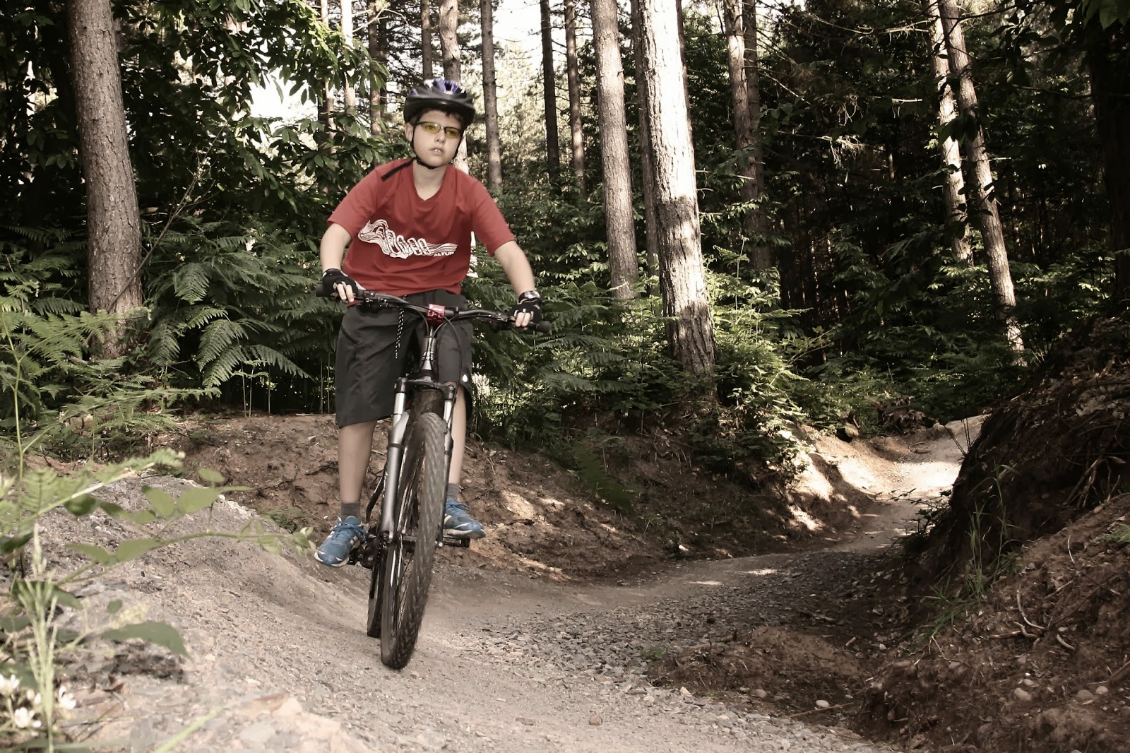
For this exercise I took an existing image from Assignment 1 and looked at processing it creatively in three different ways. It was taken late afternoon so there is a warmth to the image and probably too much contrast.
 |
| 1/125 F4.5 ISO400 24mm (x1.6 crop factor) evaluative metering, daylight white balance, flash |
Image 1
I experimented with toning down the colours and giving this image a more urban feel:
Opened in Photoshop CS3
> Adjustment layer > curves > set tone with grey dropper tool on grey tyre
> create new adjustment layer > gradient map > box 3 black and white
>layers opacity slider to merge the two layers together
>adjustment layer > photo filter > warming filter (85) >34% density
> flatten image
> save as
At the stage of merging the image together, I realised my son’s legs and face looked slightly grey which was the effect of using black and white. So to warm up the image, I applied a gold filter. This worked, but not as effectively as I would have liked. I thought the overall effect of the image was acceptable and could work applied to a muddy image. The effect was not dissimilar to a preset effect in my add on software for Photoshop.
Image 2
Over the summer, war time history of Sherwood Pines has been brought into the public eye with the building of a replica WW1 trench. I discovered that some of the interesting circular trenches the local mountain bike enthusiasts called “bomb holes” were just that. Circular trenches had been built by the Royal Fusiliers in 1915 for artillery practice. I found a few old photos on the internet and recalled an information board about Lord Kitchener with of photos WW1 at the start of the cycle trail named after him. What I hoped to achieve was the tones seen in world war 1. These had alot of dark contrast on the people and buildings and light sky and ground.
> Adjustment layer > curves > set tone with grey dropper tool on grey tyre
>Filter > Nik Software > Silver Efex Pro > dark sepia
> flatten image
> save as

I was pleased with the recreation of this type of image. Although it is a preset choice, It took experimentation and comparison with old images to choose the right look, so I feel I have gained from the process.
http://www.bbc.co.uk/news/uk-england-nottinghamshire-24231397 accessed 4/10/13
Image 3
What I really wanted to do was change the daylight to night time as we do alot of night riding in the forest in the winter. However, after experimenting and reading several forums, I realised that it would be easier to take a night time picture!

I decided instead to further investigate the efex add in and see what I could make work with a high contrast image. I liked antique plate 1 because it made the central image stand out, kept the tones mid range and made the viewer focus on the image.
No comments:
Post a Comment