Looking back over Digital Photographic Practice 1
This course was divided into 5 parts: workflow, seeing like your camera, monochrome, real or fake and researching and implementing a personal project and then reflecting back on it. I have taken each part in turn and looked at what I think were my ten best images from my assignments the learning that took place around my assignment work to form the basis of my submission for formal assessment.
I had 10 photos printed in A3 size and mounted them in A2 mount board. This was the first time I had enlarged my work to this size (apart from viewing it at 100% on a monitor which doesn't enable me to see the whole image at once). I was interested in the detail which my camera had picked up on some of the images which I hadn't appreciated until I viewed the whole image and looked at it with a magnifying glass when removing lint prior to submitting.
Looking back, I enjoyed this course far more than I thought I would. It has enabled me to understand my camera and the importance of the final image, learn how to take photographs with difficult lighting conditions and encouraged me to look at using Photoshop in a much more creative way. I found working thought a project after writing a proposal, then evaluating it helped when visiting Nottingham Trent University's Photography degree show as I was able to look at projects more coherently.
Assignment 1: Workflow
This assignment concentrated on developing an effective workflow
and promoting good housekeeping and organisational skills.
I decided to invest some time during this part of the course to
develop my skills in mountain bike photography because it is a sport I enjoy
and I am often asked to take photographs of my husband and his friends whilst
out riding or competing in races.
I used some of the exercises to look at my existing processes and
perceive where improvements were necessary, so that by the time I undertook the
assignment, I had an effective, organised workflow to follow pre and during the
shoot and for processing and archiving.
For the assignment, I put together a narrative to illustrate with
a mix of action and static shots. I reflected that my first take did not have
the correct mix of images so I organised another session to retake them.
What I enjoyed about this set of exercises and assignment was the
journey of exploration of technical skills combined with location and testing
to see what worked. It was easy to research that a photographer used certain
camera settings, but actually experimenting to see what worked for me was more interesting.
For example – trial location shots to determine how fast the rider needed to be
travelling to show motion, examining how a high ISO affected the images,
whether I should considered using the pop up flash or a speedlight flash unit
and which natural lighting conditions worked best. I was able to see
progression with my images, and having completed the course I have a greater
understanding of why and how the images work. I selected the image below to
submit as a print to represent Assignment 1 because it showed where I was at
the time.
I planned and took this image as an action shot to portray the
rider’s speed, skill and determination / concentration.

The rider’s face shows concentration and determination to do the
technical jump. The speedlight flash made the rider stand out against the
background and looks sharp against the trees and motion is shown by focussing
on the rider whilst panning the camera. The trees add a sense of place and the
diagonal track adds additional drama. By including some of track, one can see
where the rider has come from and assumes that the rider is continuing along
through similar scenery. By taking the image in the evening the natural light
is softer and so too are the shadows. A low ISO ensures that the detail in the
darker areas of the image is preserved.
Research on how other photographers took mountain biker images
enabled me to consider the placement of the rider within the frame. Test shots
of different locations enabled me to look at perspective and where to position
myself safely.
My tutor commented that “care
had been taken with the composition and this is seen in the action shots”. Norrington
(2013) I was pleased to receive positive feedback as I had considered the
composition carefully.
Following
feedback from my tutor, I installed Lightroom and used it for the remainder of
the course. Once I became familiar with it, I found it saved me time.
Reference
Norrington, A,
(2013) Tutor feedback Assignment 1 workflow, unpublished
Assignment 2: Seeing like your camera
This assignment focussed on producing
photographs with high contrast scenes to demonstrate I had an understanding of
how my camera sensor sees and how I could correct it “in camera” to accomplish
high quality images.
I chose to submit two images from this assignment to represent my
learning journey because this was an area where I enhanced my skills by
undertaking useful preparatory exercises to equip me for the final assignment.
During the exercises I began to understand that my camera saw in
tones of grey and how much difference a stop could make to an image. I
experimented with noise to see how it crept across an image. By applying theory
to the composition of my images, I felt my images began to improve. All the
exercises were very visual and it was great to actually “see” what effect of
minor adjustments made to the image. The other area I had not appreciated
before was how different the scene I see is compared to how the camera renders
it. I read around the subject further to enhance my understanding of the
concepts.
Back lighting
Assignment 2
I set out to take a photograph of a bright translucent flower using
backlighting which contrasted against an uncluttered dark background and showed
detail and form creatively. A comment I received on my previous course
described a set of images as almost being forensic so I looked for
compositional shapes to soften the image. I wanted to challenge myself and
attempt something which had inspired me when I read two books by Edwardes
(2009) and Fyre (2009).
“From my own research, I
discovered that even a thick leaf such as Ivy, when back lit, became
translucent.”
Hampshire (2013)

I used a singular cut flower so I
could position it against different backgrounds. To work with the high contrast
scene, I used edge lighting. The light reflected off the rim of the petal and
through the petal whilst the background was in the shadow of a bush. I
overexposed the petals by 1.5 stops to make the petals become white, and because
the background is dark, it copes with being over-exposed and doesn’t show much
noise due to the low ISO.
I was pleased with this image and in my opinion felt my research
had paid off. The flower had a fairly soft “s” shape to it; it contrasted well
against the background and showed detail both in light and shadow. The colours
worked by overexposing the image.
Indoor Scenes illuminated by a single source
of high luminance
This seasonal scene represents Halloween (sweets and lights to
represent the custom of trick or treating). I was inspired when my son discovered his lolly had a red
light inside and started shining it through various objects. To achieve this image, the lollies had to be clear enough
to shine the light through. I ensured the pumpkin was dominant
and the sweets only occupied a small space in the frame. There is a reasonable
depth of field within the image. I positioned the camera high on a tripod and
looking down on the pumpkin light. This enabled me to use a low ISO and ensure
there would be minimal noise within the shadows. At this point I was working in
JPEG only, so colour temperature was controlled in camera.
“I knew from the colour
temperature exercises how my camera would handle candlelight, and previous
exercises how it saw tungsten light.” Hampshire (2013) This image used tungsten (3200Kelvin) to
give a warm glow to the images. Following tutor feedback I have established the
practice of also taking a RAW file with the camera set to auto white balance
and tweak the colour temperature when processing.

This exercise prepared me for my
night time shot in Assignment 5. I felt I learnt a great deal from this aspect
of the course.
Reference
Hampshire N
(2013) Assignment 2 Seeing like your camera (unpublished)
Hampshire N
(2013) Assignment 2 Seeing like your camera (unpublished)
Bibliography
Edwards, G, 100 ways to take better nature and wildlife
photographs, (2009), David and Charles, Cincinatti, Ohio
Fyre, M, In the footsteps of Ansel Adams and the great masters,
Digital landscape Photography, (2009) Ilex Press, Lewes, UK
Assignment 3: Monochrome
This
assignment explored the creative process of monochrome; from deciding upon a
suitable subject, photographing the subject taking account of the lighting /
weather conditions and processing the image using software to bring out the
form, tonal contrast, texture and if possible key of the image.
Adapted from Assignment 3
As preparation for this assignment I
looked at the work of Bernd and Hilla
Bercher because I liked their straight forward, organised,
representational and graphic style of photography. They showed the form of the buildings they photographed. I liked the fact
that their images did not include movement or people – personally I thought
their photographs were about the building and not about how people related to
or with the building. I decided to include this piece of their style in this
assignment. I also studied Eugine Atget’s work. In my opinion
everything seemed balanced, even if it was asymmetrical. His photographs
always had somewhere for the viewers eyes to go, and on closer viewing found
something you didn’t know was there immediately.
Sutton Scarsdale Hall, Derbyshire (now
a derelict house in the hands of English Heritage) is known for its Italian
stucco plasterwork. The remains of the weathered classical columns and baroque
style façade showed great texture, and the corridor style house revealed itself
in skeleton with a series of archways providing volume. In all, I felt that
this was a house waiting to be explored and offered potential to explore the melancholy
atmosphere. The limitation of this building was that some rooms were locked and
images had to be taken through the railings.
Assignment Reshoot: Rear façade Sutton Scarsdale Hall

This
image was taken when I went back to reshoot. I had initially used a wide angle
lens and a portrait orientation to show the church next door. My tutor
commented that the original image had “some
fall off caused by the very wide lens. A more straight on approach (if
possible) would allow for the fall off happening evenly on either side of the
building. The image may be better suited to a less wide lens.” Norrington (2014) Access was limited meaning a
wide angle lens had to be used and there is still some fall off present
although I have corrected as much as possible.
I
cloned out the yew tree branches in order to balance the image and allow the
eyes to wander into the image along the drive. I used sliders to brighten the
house and brought out the detail and colours in the stonework.
This
image shows tone, texture and volume and the only clue that the building is
derelict is perhaps the lack of reflection from the windows. The overcast day
helped the mood of the image to look sombre. I felt the soft curve of the drive
contrasted well with the formal shape of the building.
Assignment: Exposed corridor through interior of Sutton
Scarsdale Hall

My tutor confirmed my thoughts, “Here you have kept the detail in the interior by sacrificing the
window at the end of the corridor. For me the puddle draws the eye down the
corridor and provides a useful pause in the frame.” Norrington (2014)
Personally I feel that I benefitted
from going back and reshooting some images. It taught me to follow my instinct
and review and reshoot if I felt it necessary.
References
Norrington, A,
(2013) Tutor feedback Assignment 3 Monochrome, unpublished
Norrington, A,
(2013) Tutor feedback Assignment 3 Monochrome, unpublished
Bibliography
Hampshire N,
2013, Assignment 3 Monochrome, unpublished
Assignment 4: Real
or Fake?
This assignment explored
the issue of technique and ethical choices made in photography by designing and
producing a photographic image illustrating an imaginary magazine.
Inspiration for this assignment came from watching a
stage of the Dukeries Car Rally pass through Sherwood Pines Forest,
Nottinghamshire in November last year. I thought it would make a good subject
to study as I had a radio control cars to hand and there are existing
publications on the market.
This assignment really tested and developed my
Photoshop skills. I recalled at the beginning of the set of exercises leading
to the assignment I found it difficult to cut and paste one photograph into
another, but by the end of the assignment I felt I had gained an understanding
of the tools available and how to use them to create an image. It formed a good
base for understanding how I could manipulate an image for assignment 5.
My final amalgamated image consisted of three parts:
the background (a track in Sherwood Forest), the rally car and the insert.

The background was shot
late one afternoon in January when rain had eventually stopped to give the type
of scene that I associate with rallying (cold, wet, misty, muddy). The time of
year worked well because I did not have to manipulate the background. I
considered the colours which would need to complement a red and white rally car, and thought autumnal
browns, greens and silvers of the trees in the background would add contrast to
the final image. The shot had to be portrait which I learnt from reviewing my
images of the rally. (I had taken my images in landscape). I planned enough
space on the background image for positioning the title, subtitles, car and
insert picture. The background required minimal enhancement in Photoshop
(curves and colour temperature).
I used a black background to create a contrast between
the background and rally car so I could cut and paste it easily onto the
background. I divided the frame into thirds and sat the car off centre on a
diagonal to add impact and drama to the image. I experimented with different
positions and lighting and used soft natural lighting (light through a window)
because it kept reflections on the bodywork to a minimum.
When combining the two images, I considered that because I had
used natural lighting for both, the image was more coherent. A drop shadow
gradient enhanced the image giving it plausibility. Further reality was added
by cutting and pasting the orange headlamps from the photograph of the car outside
(caused by the sun reflecting off the headlights) making them look like they
were switched on.
The insert image used tungsten lighting to illustrate
a seasonal winter project. I changed the background colour to fit in with the
theme and decluttered the image. This was in the style of magazines which I had
researched. A triangle shape was used quite often by the radio control car
magazines and worked with my main image being a diagonal.
My justification for using Photoshop tools were that
they were necessary to make the car blend into the background and still look
real. To have taken an image of an RC car in the forest would possibly involve
a forced perspective to which one could still question the reality. By cutting and
pasting an image and erasing the background to tidy it ensured the image fitted
in to the background as I wanted it to.
In my opinion final image looks realistic. I deliberately positioned the
car so that there was some space around it, and the sandy track kept the car
grounded. By positioning the car on a diagonal it adds drama and impact to the
image. The car has somewhere to go by leaving track visible. By blending
in a little shadow and using natural lighting, it gave the appearance of being
taken as a single image. The green and red colours are harmonious and work with
the autumnal leaves and slightly misty weather. The aerial on the car
links the image to the title of radio control cars. Personally, the scale of
the car is reasonable - it doesn't look out of place.
I have included this image with the titles left on
because it links the images together. Although I appreciate that the font would
be chosen by the editor of a magazine, I felt the image worked better showing
my intent.
Adapted
from Assignment 4
I
chose to include two ethical issues on the magazine cover to illustrate recycling
through restoration and encouraging people to take their cars outdoors
encouraging a healthy lifestyle.
The
other consideration for my magazine cover was whether it would sell or just sit
on the shelf. I tried to pitch it in the middle of magazines; not elite
and not a weekly edition. I imagined it being made of reasonable quality paper
and being kept by the reader for some time as a reference magazine.
I like to produce
realistic, acceptable photographs that inspire others and can be used for
teaching or storytelling. I think surreal images are acceptable but they have
to be believable. For instance, one of the collections that inspired me at
Focus on Imaging Derby 2013 were photographic images of plants by Putput
which when viewed from a distance looked realistic but actually contained household
objects such as spaghetti servers and body polishers. I was reminded of this
work when researching photographs of Sian Bonnell.
Extract from learning blog
(Jan 2014)
“I looked at the work of Sian Bonnell in
preparation for Assignment 4 real or fake? It reminded me of the work of putput which
I had seen at the Chocolate Factory in Derby last year. I found the way that
Bonnell used the landscape as her background interesting. The series on
"where the domestic meets the wild" featuring pegs and teatowels etc
I found easy to relate to as I had used a washing line, pegs and washing for as
assignment image last year and could see myself building upon this and
exploring the garden in this way. Her jellies were an interesting concept and I
questioned the "reality" of this. I saw it as a creative image
although they look like real jellies in real situations.”Hampshire (2014)
In
keeping with the type of magazine I had chosen to illustrate I needed to keep
my image real to attract the readership, although my final cover had combined
images. I reconsidered my cover and whether I should have chosen a different
type of genre, and the more I thought, the more ideas I came up with. I think
that for where I was at the time with learning how powerful Photoshop is and
what it can do, it was good to start with something quite realistic because I
knew what I wanted to achieve and reached a point where I was satisfied. I
think if I had created a surreal image, because it is not my type of image, I
would still be left wondering if it was successful. This assignment allowed me
to explore my thoughts around how much manipulation was acceptable. I felt that
this was not too far removed from the truth. I developed my thoughts around
manipulation further in Assignment 5.
Reference
Bibliography
Hampshire N
(2014) Assignment 4 Real or fake?
Assignment 5: Personal Project
Bridges of the navigable River Trent
(Nottingham to the Humber Estuary)
Is the River Trent recognisable from its
bridges beyond Nottingham?
For
assignment 5 I planned to do something which would enable me to put all the
skills learnt over the course into practice. Having been inspired throughout
the course by Hilla and Berndt Becher and discovered more about the field of
topographical photography, I put together a research proposal based on the
above question.
I was
prompted to consider this question after glancing at a TV quiz show in which
the presenter asked contestants to name rivers of capital cities by showing
them an image of a landmark. I questioned whether one identified the river from
the landmark (e.g. bridge) or is it the landmark which is identified with? I
decided to test the theory with my nearest large river.
I planned
initially to use a mix of colour and monochrome used because I thought people
may associate some bridges by colour – especially the two in Nottingham which
are green. Two thirds of my images are colour because I like working in both
colour and monochrome. Where I thought an image showed more form in monochrome,
I converted it. It was only after submitting my work to my tutor that showed concern
that I had mixed black and white photographs with colour which may look
incoherent as a set of images unless I set out a good reason for including
both. Occasionally the weather conditions meant that the image looked
more acceptable to me as the photographer in monochrome. Images I had seen
whilst researching had been in colour and monochrome, and sometimes the same
image was in both on different websites.
Composition of the images had
to include all or part of the bridge. I looked at work of Robert Adams, John Davies, Lewis Baltz and the Bechers.
Extract from assignment 5
“The
photographers I looked at had space around their objects and with access to the
surrounding area being limited; I found this was the most difficult part of the
photograph. The River Trent means river which floods and most of the
surrounding area is floodplains. Once the river was in flood, the challenge
became harder. In Nottingham, I discovered the river was so wide that to fit
the whole bridge in the photograph meant the bridge was lost within the image.
Most of my final images included leading lines and in some, I used a bridge to
frame an object but the bridge is still dominant.
I made
use of early morning and late afternoon light where possible. Due to weather,
environmental conditions and the short timescale of my project, I used a polarising
filter so I could photograph on sunny days. Unlike the Bechers who specifically
chose cloudy days for photography, I found that some of my structures came
alive during sunshine or night-time.
People
are not visible within my scenes but have had a part to play within them such
as maintenance and renovation / preservation, employment in the factory and
travelling across the bridge by train or car. The fact that the earliest bridge
was built in 1850 (164 years ago) and is still in use shows that it is
necessary to have bridges, and where possible, many of these bridges have only
been strengthened or adapted rather than replaced. One can look at the
engineering history of the bridges and note how well they have stood up to
their design and build. This is useful documentary evidence and so for this
reason it is important for me as a photographer where possible not to
manipulate the bridges.
Robert
Adams talked about creating stillness within his photographs. I set out to
include movement within my scenes by including pigeons, fast flowing water,
smoke, transport, kinetic energy and the river in flood because I think the
river is alive and I am intrigued to know where the water has journeyed.”
Trent Bridge, Nottingham
Extract from assignment 5
“The
afternoon sun caught the gold paint and stonework making it gleam. The colour
of the paintwork is synonymous with the City of Nottingham, so I thought that
should be represented. To include the landmarks of Nottingham Forest Football
Ground turned the image into a postcard scene and I wanted to capture more
decoration detail because I think in today’s busy world it goes unnoticed. The
curve of the bridge and its decoration lead the eye towards the lamppost. I
exposed some and not all of the ironwork under the bridge as I wanted the
decoration to be the dominant part of the scene. I think the image looks three
dimensional. Some colleagues who are familiar with the bridge were unaware of
the decoration although recognised it from my postcard scene.”

I was able to use a few
Photoshop skills to enhance the image such as straightening the lamp post and
removing the black cloud from the sky.
My tutor commented
that it was “a striking image of Trent
Bridge. The tight framing of the arch
fills the frame, and the lamppost is nicely placed to lead the eye into that
corner. Your framing has also handled
the brick pier well as you have included enough of it to make it look like it
should be there (it would have been easy to try and push this to the very edge
of the frame). A well considered image – well done.” Norrington (2014)
Jubilee Bridge
I chose to include this bridge
to photograph to represent the industry and power stations along its course because
there is not much in the way of industry near the bridges along the river.

“I had
taken several photographs of this bridge on a previous day and decided that to
improve this image; I needed a still day to allow me to frame the steam within
the tower of the bridge. On this particular morning, I had returned to reshoot
another bridge, and as I glanced round, I saw this was the moment. The breeze
had died down, so I hurried across the bridge, held the camera just above the
floor and waited for the pedestrians to clear.
I
converted the image to monochrome to give the image more impact and the shadows
acted as leading lines towards the factory. I felt the bridge was well
proportioned within the frame and there was space around the tower for the
steam and clouds to hang in the still air. A low shooting position elongated
the tower which dominates the image.”
Two major learning points were
illustrated to me when attaining this composition:
·
Lens focal length and time of day.
I originally started this
assignment thinking I could use one lens to reduce kit which had to be carried.
Taken with a 70-200mm lens (Effective Focal Length EFL 112-320mm) showed the
sugar beet factory and part of the bridge. By changing to a 24-104mm lens (EFL
38-168mm). The same view changed drastically.
·
Importance of time of day
At 10:30am the shadow was
minimal. By 13:10, it became a feature of the image (leading line to the
factory).
Original Photoshop work
included cloning out a ventilation cover, piece of plastic on the floor and a
lamp post to make the image less distracting and more symmetrical. Originally,
I converted the jpeg to monochrome which made the image look grainy. I later used
the RAW conversion to lessen the grain. This image was taken at F16 to give a
good depth of field so that the factory was visible. As it was an opportunistic
shot, I knelt on the floor and handheld the camera so increased the ISO to
decrease the chances of camera shake.
My tutor felt “This image is very different in style and mood. The brighter conditions give a stark powerful
image. The smoke adds to the image and
leads the eye over the walkway. Do
consider straightening the image. If you
are shooting straight on and using symmetry in composition then you want to
make sure you are straight and it will make the image more powerful.”Norrington
(2014)
In response, “I revisited this image in Photoshop to see
whether I could square up the image without altering perspective too much.
Although I could crop one side so the tower was exactly central, I found that
to start rotating the image or play with the lens distortion made the clouds,
factory, verticals on the bridge and tower all at a slight angle and to then
correct them meant rebuilding the image. I decided that I did not have the
skills to manipulate the sky so would have to leave it for this time and bear
the advice in mind for future. As this is a suspension bridge, I am not sure
that it is completely level. A tripod would have helped, but this was an
opportunistic shot across a busy pedestrian walkway.” Hampshire (2014)
Newark Dyke
Bridge
This image was created because what my eyes saw
was slightly different to what my camera saw. The bridge carries the East Coast
Mainline so is very busy. Having watched the trains cross the bridge during my
test shot excursion, I thought that a train crossing the bridge would enhance
the image.
One of the photographers I studied in
relation to this project was John Davies. I visited All That Is Solid Melts Into Air exhibition
in Nottingham to view his image of Stockport Viaduct (1986)
Extract from learning blog
“It was great to be able to stand in front of such large monochrome
photographs and pick out the detail of life frozen at the time of taking
the image. I thought both photographs fitted into the context of the
exhibition, because firstly it captured as it was, and secondly that life may
be more modern and people think things have changed but there are
similarities between life in 1986 and life in 2014. I thought the size of the
prints on display enabled the interested viewer to absorb the details of the
image and find more hidden detail. Being familiar with the image of Stockport
Viaduct as I had looked at it carefully in relation to my project on bridges, I
was able to see and think about differences between how I had taken the image
of my train crossing a railway bridge and how Davies had captured his. I
deliberately took mine of the train and bridge in focus; Davies had captured
the train passing through the image and it carried motion blur. In my opinion,
this lent itself to his image because it was as if the shutter had just been
pressed at that moment.“ Hampshire (2014)
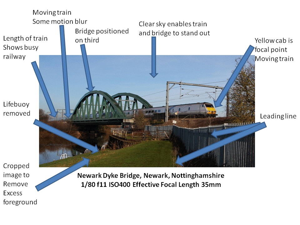
Initially, I thought I could set up the scene and press the shutter.
When reviewing the scene, I did not want the image to be all motion blur. It
needed to be the focal point. I took background shots on the tripod and hand
held the camera and panned as the train went past so I could position the train
where I wanted it in relation to the electric wires. In Photoshop, I cut out
the train and placed it on the bridge and covered a bright orange lifebuoy on
the bank. By cropping the image, the foreground is minimal and the eye is led
along the fence to the train crossing the bridge.
I felt the colours of the image worked well, and the yellow of the
engine adds brightness to the focal point. The colour of the train was
important – the black and red train did not work as well. The electric
structures are not straight and I debated whether to straighten them; although
I decided to leave them as it adds character.
Extract from learning blog Response to
Tutor feedback
“This image was one of my favourites
because I had thought about the image I wanted and unable to achieve it, set
about creating it. It showed me that Photoshop was a useful tool for enhancing
an image and gave me more realistic feel of how to use it to my advantage than
Assignment 4 because I had to learn the skills. With the tools now within my
repertoire, I was able to use them to my advantage to help me create an image
which wasn't quite there. For me, this image became a measure of my skills.”
Humber Bridge
This was the last image for assignment 5. My
original brief included a collection of images encompassing different lighting
techniques and I had not fulfilled my plans due to work on Trent Bridge not
being completed. The River Trent flows into the Humber Estuary and although
this bridge is not on the River Trent, it is near to the River Trent and is a recognisable
landmark. I decided that this image would be a night time image and spent time
researching photographs and taking daylight shots to decide where to stand
bearing in mind the curvature of the bridge. It put my workflow to the test
with the additional challenge of recent flooding which had destroyed sea
defences.

I experimented
with different positions during daylight and reviewed them on a tablet to see
what worked. The night was cloudy so no moon or star trails to consider. I
tested the length of time needed to expose the image so that the structure of
the bridge was visible and recalled reading about the Bechers counting down the
seconds to make their exposure, and I imagined it happening. Although I had
commented that during this project that I had seen very few boats, the river
appeared busy, demonstrated by light trails. A small aperture made the lights
appear like stars. The long exposure smoothed out the river and made the light
reflection look like arches which I thought gave a good effect. Taking the
image from this position on the south side of the river showed the curve in the
bridge and the glow and lights of Hull giving the image some perspective.
To enhance the RAW image, I altered the colour temperature to what I
remembered. I had expected fall off towards the left hand side of the frame,
but it was the lamp posts on the right which were not straight which I
straightened in Photoshop.
I was pleased with
this image because it was what I set out to take. My tutor agreed that the
exposure had worked, “This is a
more traditional view of a bridge, compared to the others in the project. The night time has allowed you to show the
lights to really good effect by using reflections in the water. A well-chosen viewpoint and accomplished
exposure.” Norrington (2014)
This image became a personal reflection of where I had been on my
learning journey since starting the course. I felt my workflow, although
organised in the beginning had become quicker and more accurate by using
Lightroom. I can expose for high contrast scenes and understand more in
relation to how my camera sees. I developed an understanding of monochrome,
although there is room for development. I can enhance my images in Photoshop
and again, I am sure my knowledge will increase with time.
References
Norrington, A,
(2014) Tutor feedback Assignment 5 Personal Project, unpublished
Norrington, A,
(2014) Tutor feedback Assignment 5 Personal Project, unpublished
http://dpp-nhampshire.blogspot.co.uk/p/photographic-exhibitions.html
accessed 11/4/14
Norrington, A,
(2014) Tutor feedback Assignment 5 Personal Project, unpublished
Bibliography
http://dpp-nhampshire.blogspot.co.uk/p/test-shots.html
accessed 11/4/14
This is the end of this blog. My next course is peopleandplace1
This is the end of this blog. My next course is peopleandplace1
No comments:
Post a Comment